Bay City Brewing
Rebranding Bay City's signature beers, updating their website, creating posters and sell sheets.
Client
Bay City Brewing
Year
2022
Services
Web Copy
Creative Branding
Color Story & Design
Beer Quality
Optimal
Bay City’s the fun one.
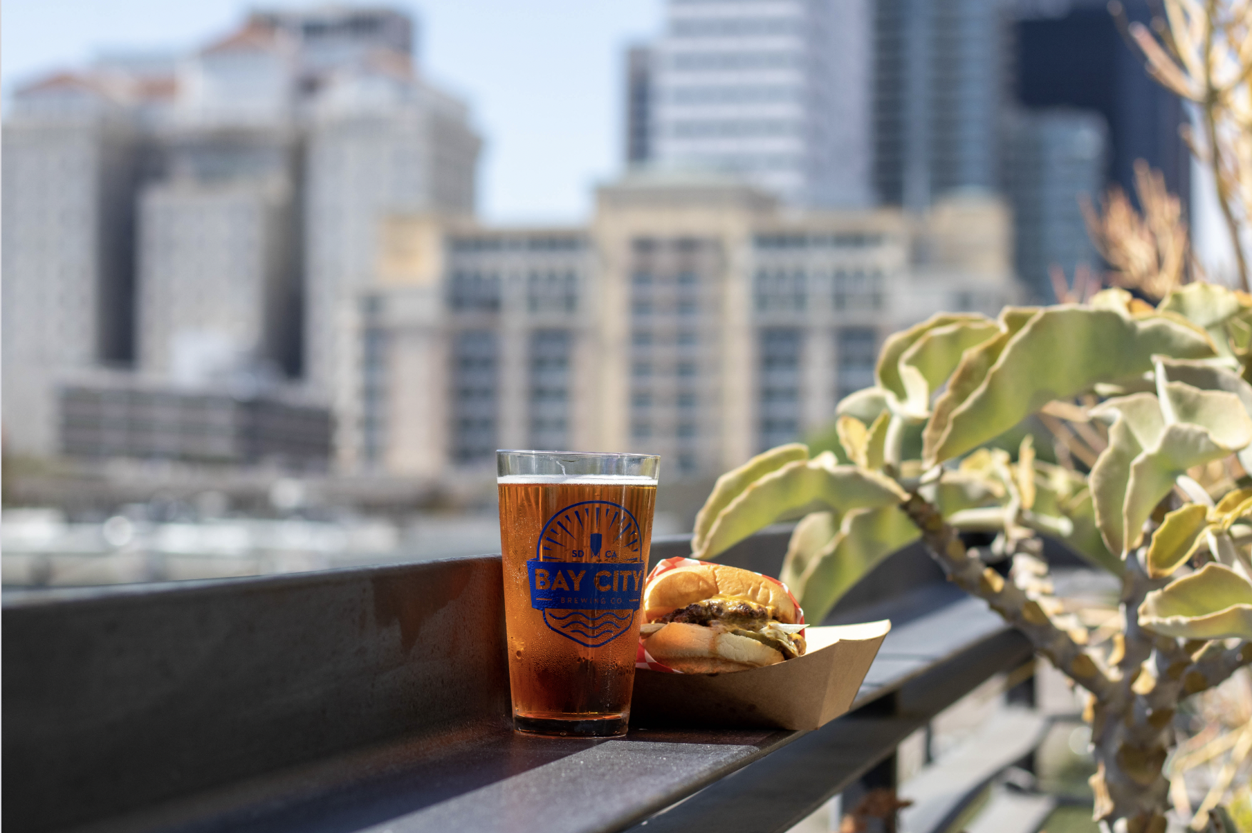
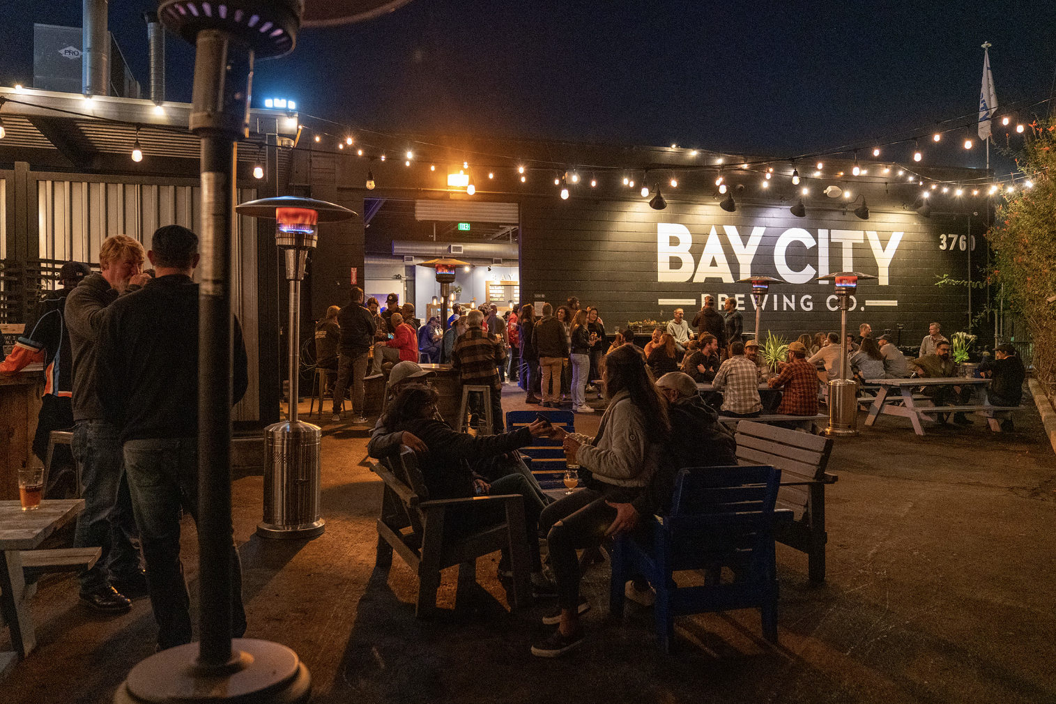
Mindgruve is located in a three-story building in San Diego’s East Village, and Bay City Brewing has a bar on our rooftop. The client encouraged us to brand each of their beers so that they felt offbeat. They warmed to weird. They were — well, it’s been said: They were fun.
San Diego Style IPA.
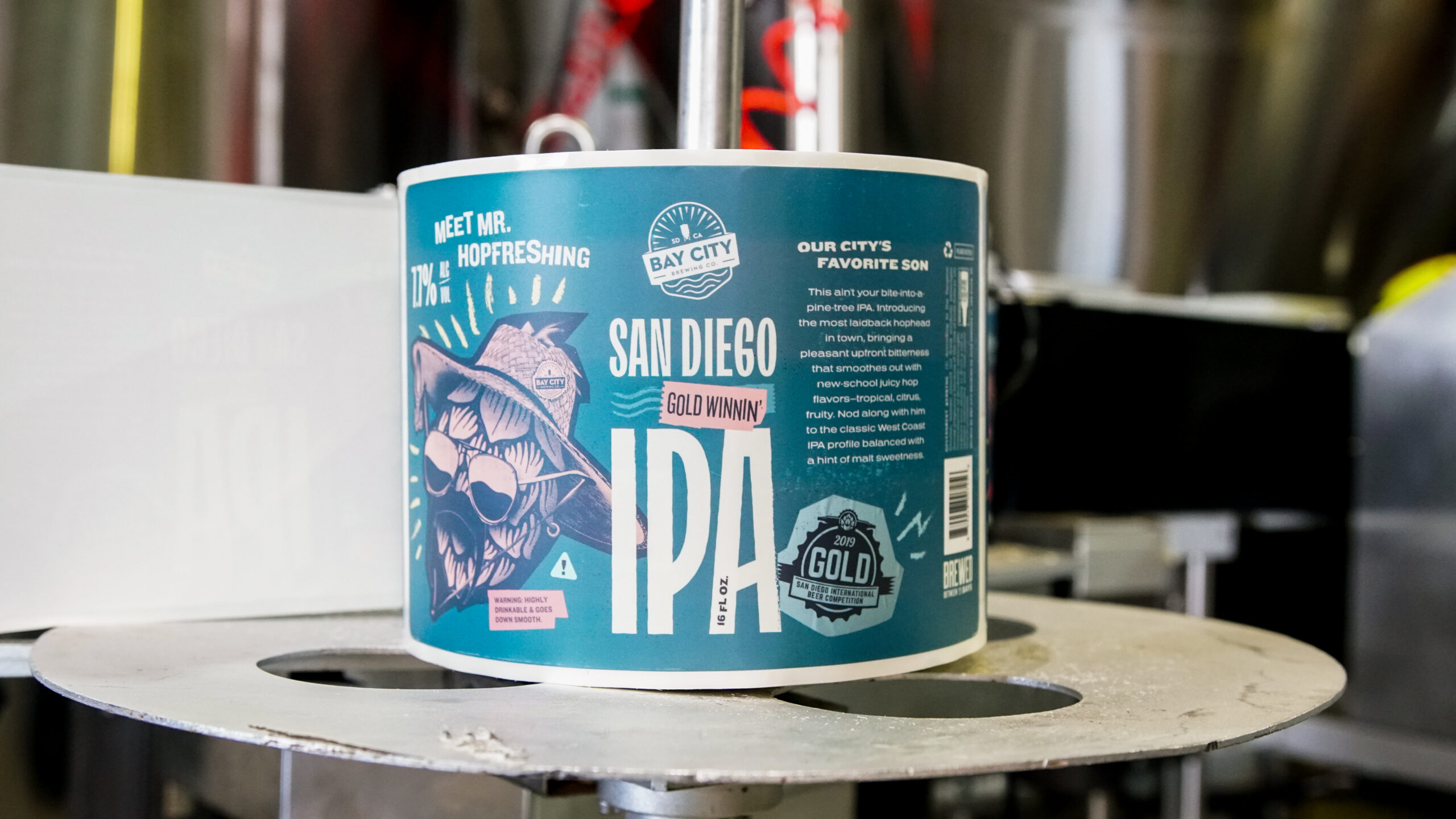
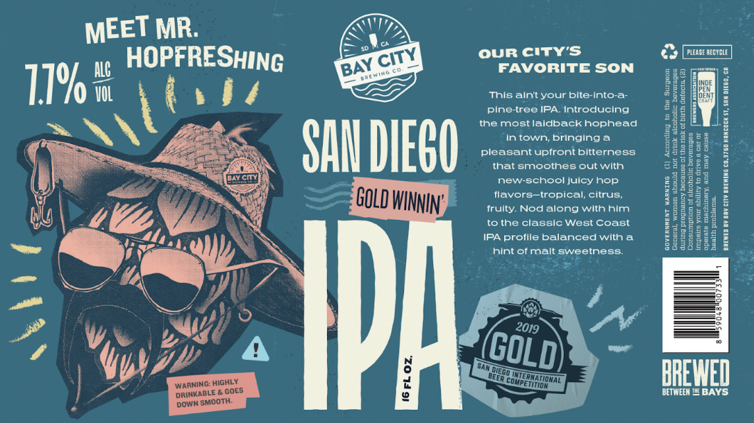
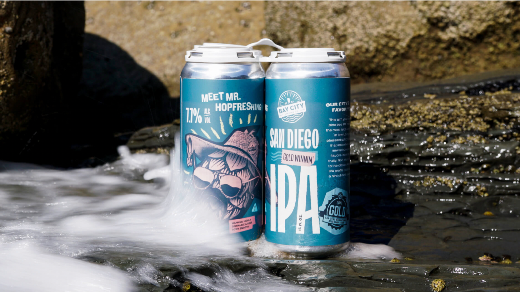
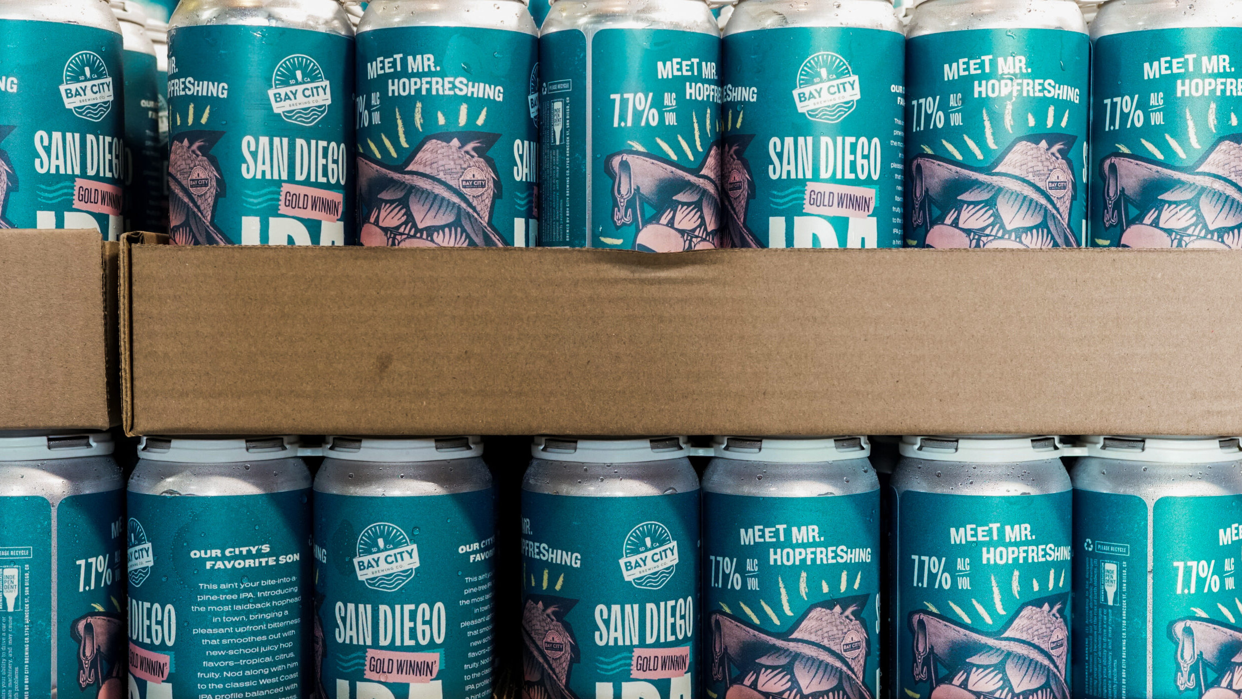
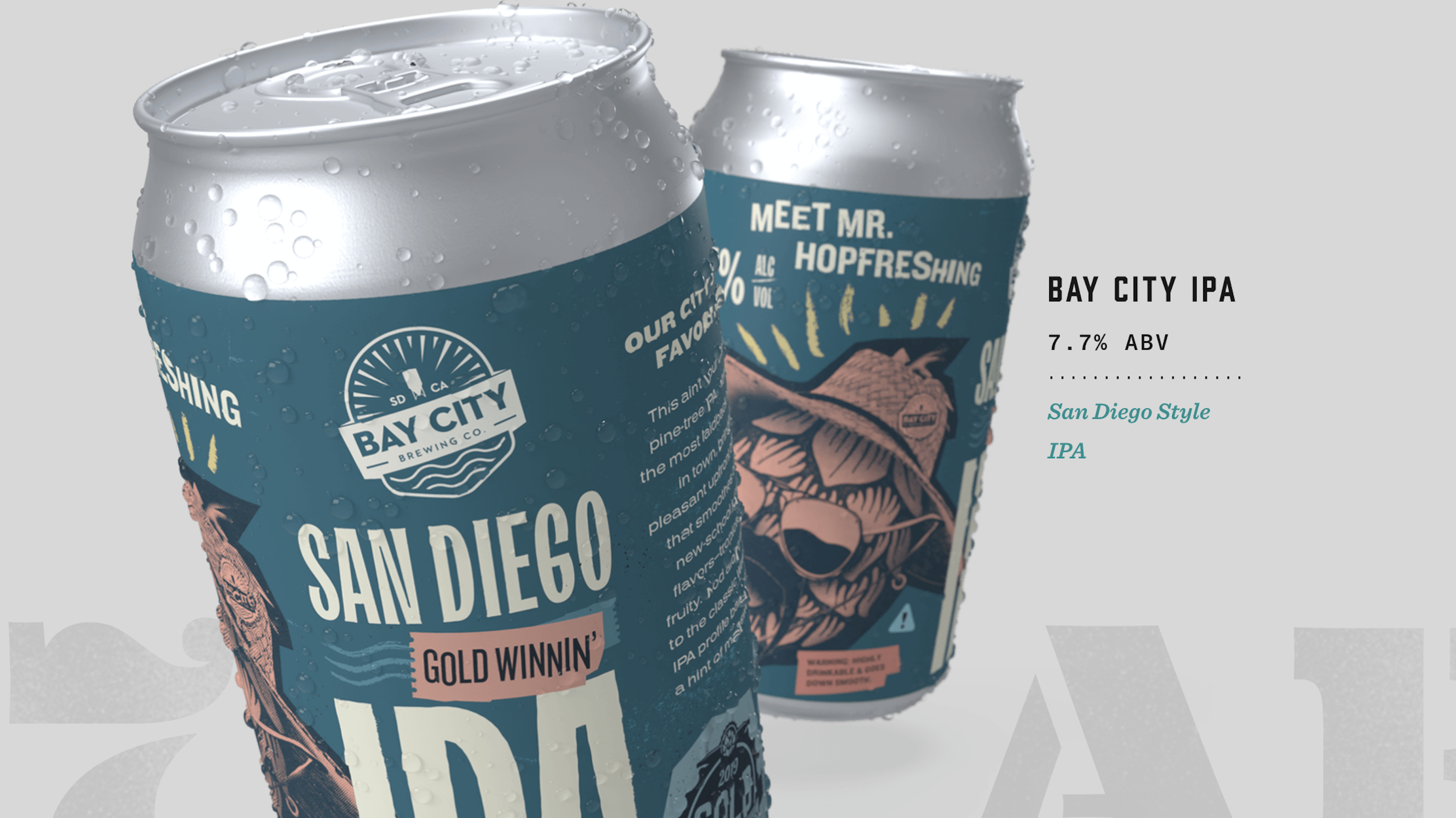
Bay City brewed a beer that they called the “San Diego Gold-Winnin’ IPA.” What makes this a San Diego IPA? According to Bay City, IPAs are popularly associated with Northern California and earthy, bitter flavors. When my wife lived up in San Jose, she stopped ordering IPAs because they all tasted like she was taking a bite out of a pine tree. So I stole her line. I started the copy for the beer wrap with this quip: “This ain’t your bite-into-a-pine-tree IPA.”
I delved into how this SoCal-style IPA was lighter and more citrusy than what a lot of beer-drinkers are used to. The messaging inspired the designer I worked with to sketch a character that embodied this beer — a single hop in aviators with an earring and a battered straw hat. That design inspired me to name our character “Mr. Hopfreshing.” We spun him into a San Diego beach bum who was, as the subcopy proclaims, San Diego’s favorite son.
I tinkered with the messaging as I wrote a beer sheet, developing a story about how drinking Mr. Hopfreshing was like taking a dip in the Pacific. This beer won a medal in a local competition, so we underlined that accomplishment, combining the gold medal, the gold hue of the brew, and the golden sunsets of San Diego in an inviting line:
“This baby is gold-winnin’ and smooth like a beach cruiser on the boardwalk, setting the pace for good vibes, good surf, and a good time.”
Power Play IPA.
Bay City Brewing loved our grapefruit-colored hophead so much that they ordered another round of creative. This time, it was for another of their favorite beers: the Power Play IPA. Bay City has two locations — one in our building in San Diego’s East Village, and one across the street from Pechanga Arena. San Diego’s pro hockey team, the Gulls, plays at Pechanga. So the client wanted us to rebrand the Power Play to serve at Gulls games. The tone of the copy and the stark color story of the design turned this beer into the most aggro player on any hockey team. And the headline practically wrote itself: ”Wet your beak.”
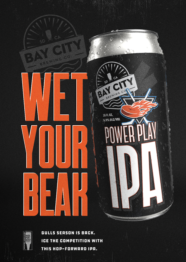
The Power Play is the enforcer, the muscle, the heavy. Just look at this guy. He’s got metallic accents and tape crossed over flaming pucks flying at you out of a background that feels battle-hardened and menacing. Yet this beer also has a flair and a no-nonsense gusto capable of summoning a rallying cry for the crowds who are guzzling it down. “This West Coast IPA punches your tastebuds with vibrant flavors of tropical fruit, blueberry, and citrus peel,” we wrote on the back of the full wrap. ”We should be penalized for making a beer this tasty. So grab one and raise it high for San Diego, for the fans, for the win.”
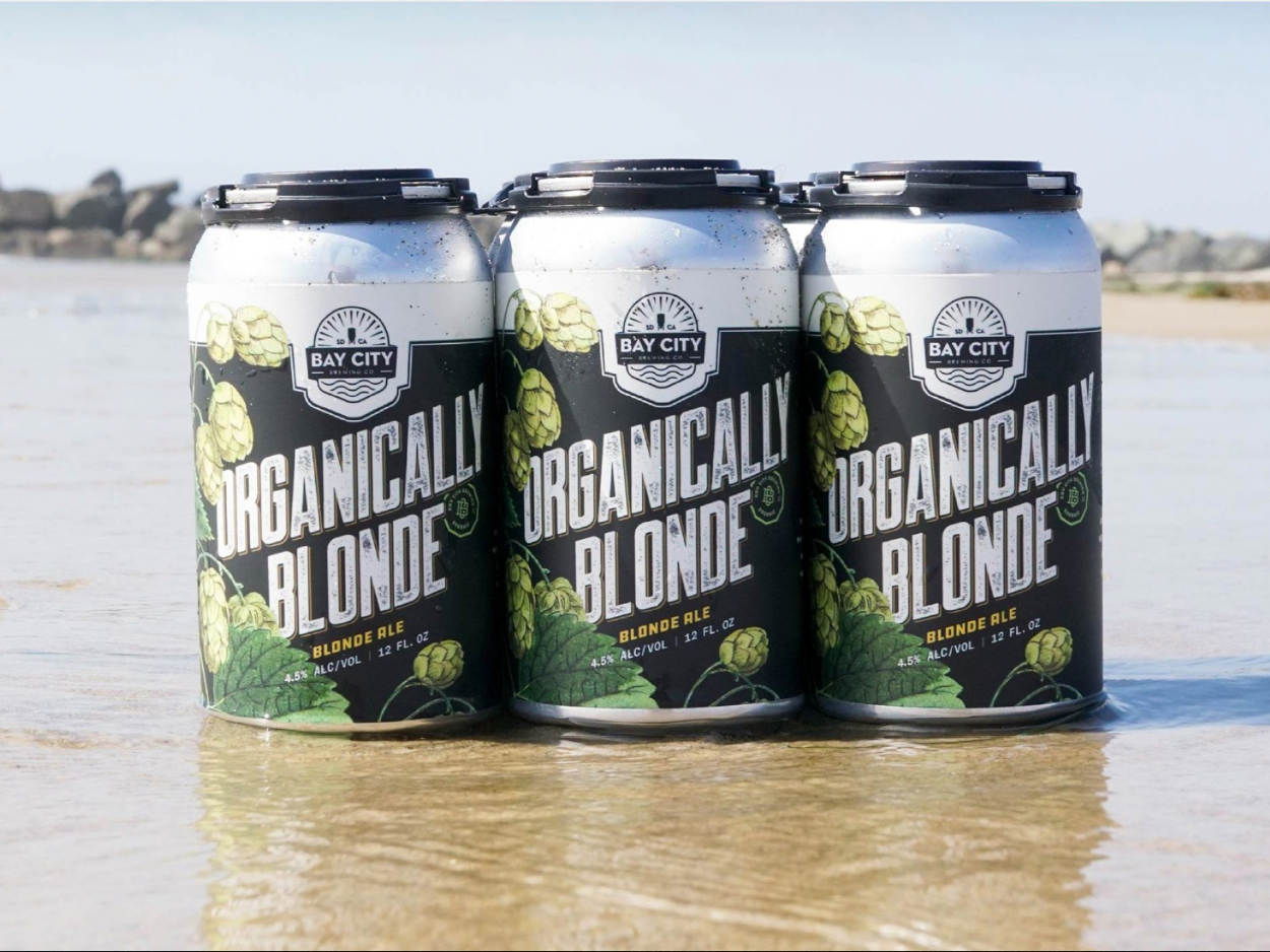
Organically Blonde IPA.
The third beer we rebranded for Bay City was the Organically Blonde. Light-bodied, with a perfect balance, the Organically Blonde is the whimsical cousin of the pilsner — a gluten-reduced blonde ale brewed with organic hops and malts who’s also a lotta fun. Here she is, stretching out on the waves.
Eminently crushable.
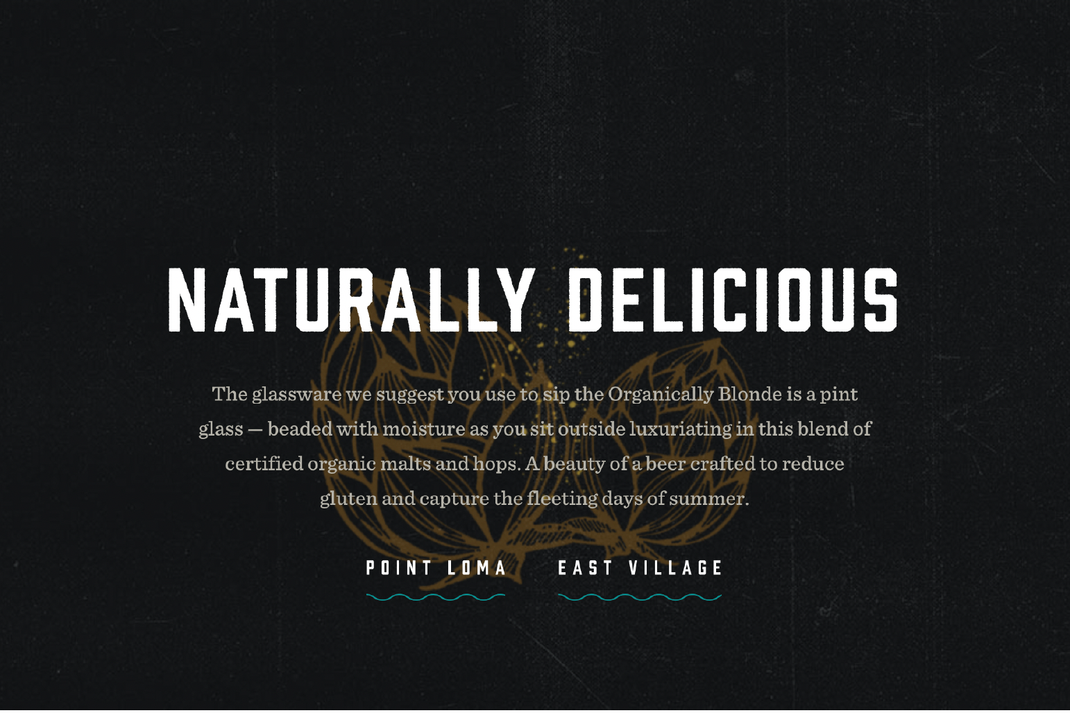
That snippet you see to your right? We wrote that for the hero on the beer page of the website. The Organically Blonde inspired us to tumble into nostalgia for soft nights and summer days.
