DuPont
In 2022 DuPont came to Mindgruve with a broad request: Audit their site’s UX. Well, let me backtrack slightly. DuPont owns upwards of 120+ internal brands, so they asked us to audit the UX of two of their sites.

Analyze foundational copy and design UX elements for two sprawling internal sites.
Years
2022–23
Services
UX Copy
Content Strategy
Information Architecture
Client
DuPont
Site Layout
Polished
Overview
Clarity and simplicity.
Most of us are familiar with DuPont as a Fortune 500 company that specializes in chemicals. Yet DuPont’s global operation encompasses military gear, water management, car battery assemblies, and much more — including granite, quartz, and porcelain installations, which is the product line we primarily focused on. DuPont tasked us with analyzing the UX of two of their sites:
Main Site
Top-level domain housing all of DuPont’s brands, products, services.
Corian Sites
Suite of brands retailing quartz, granite, and porcelain solid surfaces.
What does ”analyze the UX” mean? For this project, it means that the client wanted us to root around and tell them what stuck out to us as a graceless digital experience. So a design director and I paired up. He analyzed the foundational design elements while I focused on the messaging. In all, I submitted around 100 pages of UX copy recommendations. These are the highlights.

Main Site.
I must have scrutinized hundreds of modules and thousands of elements in this site. For each one, I asked myself whether it added anything to the design. Most importantly, I made sure the design routed the user from module to module, page to page, so that the experience minimized the user’s cognitive burden. I gave myself permission to fixate on the details, because all the elements are tantamount to individual tesserae cohering into a larger mosaic. Often I felt that my sharpest insights were the smallest ones. Consider this analysis of DuPont’s “Careers” page:
⸺ Analysis.
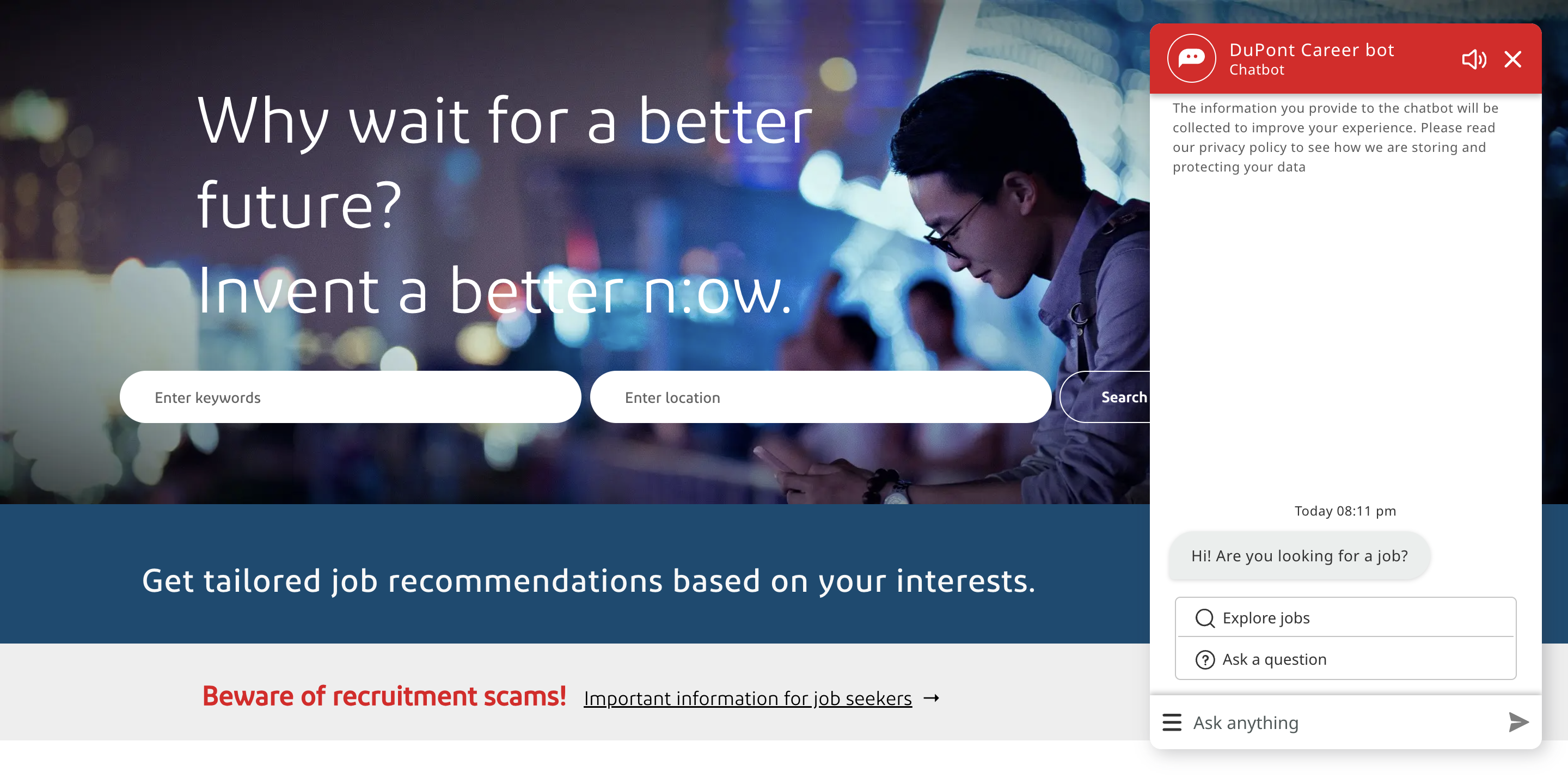
Within seconds after the page loads, DuPont asks the user if she’s looking for a job. That might seem helpful, but on the “Careers” page, it’s more likely redundant and abrupt. The flow of this page already makes it easy for a candidate to search for a job without a lightbox or a pushdown ad or a bot cluttering up the layout or following her around.
⸺ Recommendations.
Eliminate pop-ups, chatbots, or other widgets pestering the user.
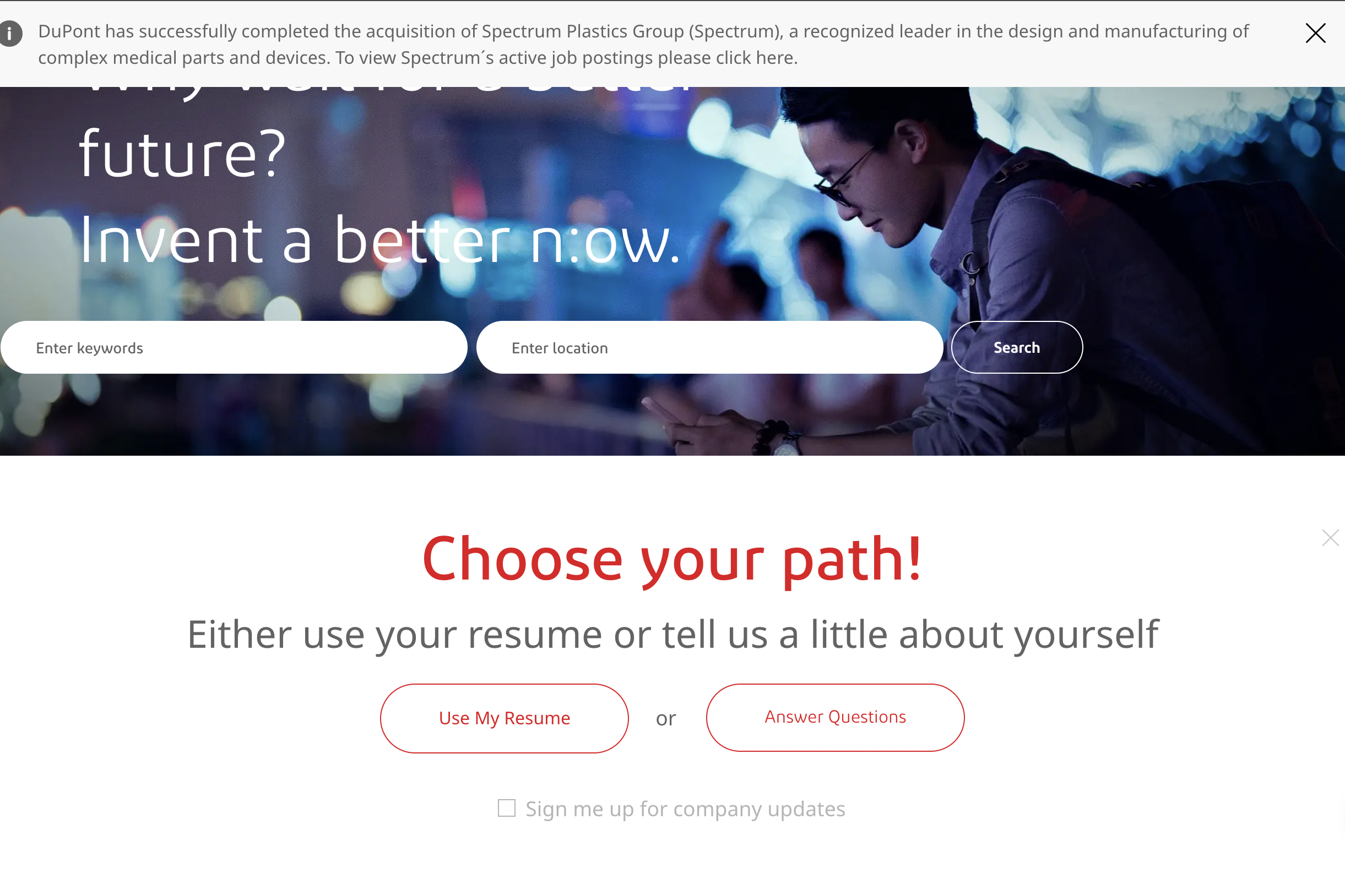
⸺ Analysis.
Browsing open positions on any site should feel easy. Instead, here it approximates a choose-your-own-adventure maze. Look at that screen. The user has to divide her attention between an announcement about how DuPont acquired Spectrum at the top, a searchbar beneath that, and the fork in the road that “Choose your path!” represents.
⸺ Recommendations.
A/B test the efficacy of the “Choose your path!” module. Stay open to just including a simple searchbar at the top of the page.
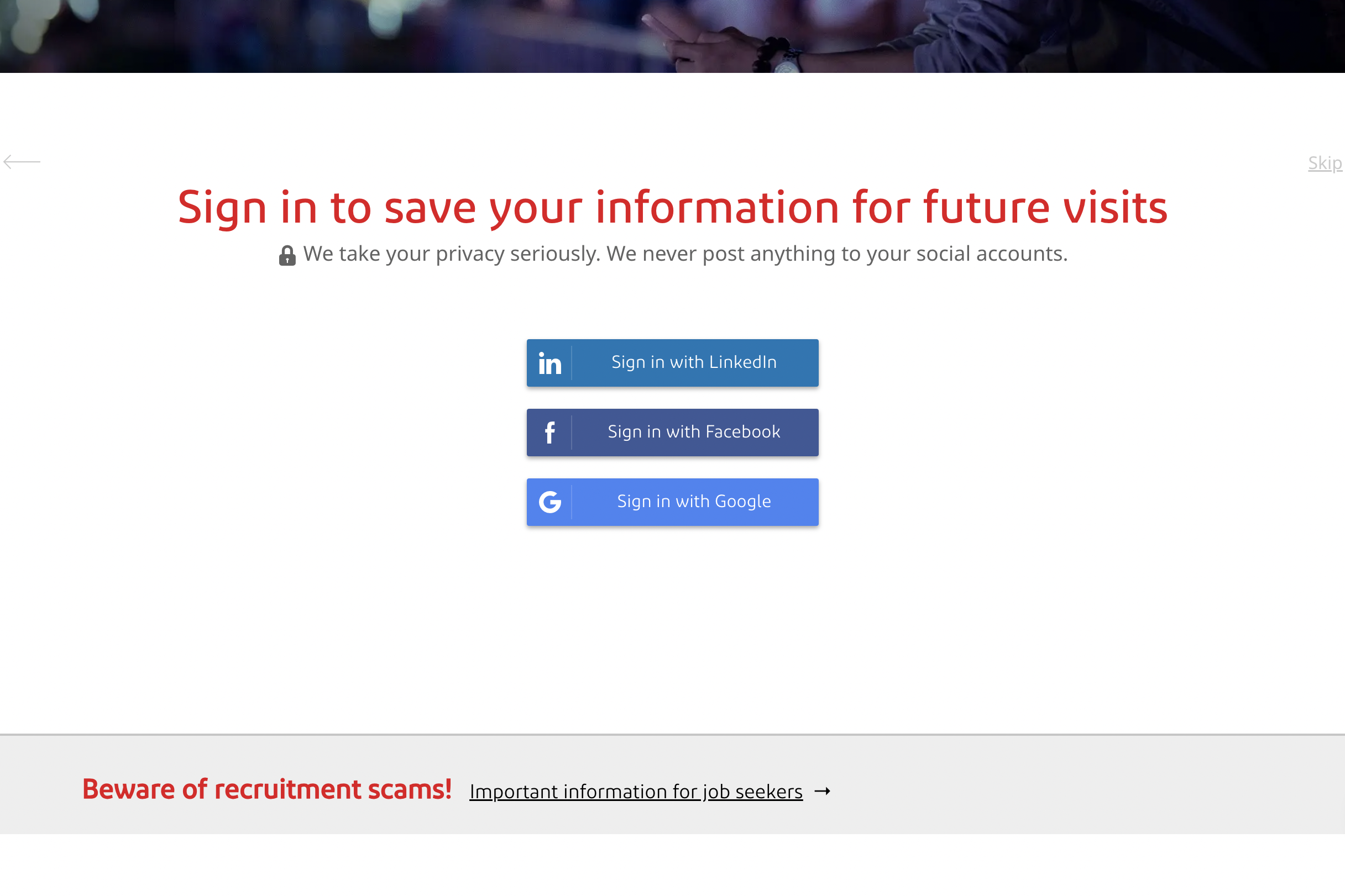
⸺ Analysis.
Imagine that the user selects “Answer Questions” in the previous screen. This screen makes it feel as if she’s being linked off to other sites. That image of the lock is meant to serve as an emblem of security, but in this context it feels intimidating, signaling that the user must commit to signing in or sharing her information. That requires work on her part. Maybe she’s up for it. Maybe she just wants to scan job openings. Either way, her cognitive load is inching up.
⸺ Recommendations.
Consider combining the “Use My Resume” and “Answer Questions” portals so that this journey doesn’t feel like an arterial maze.
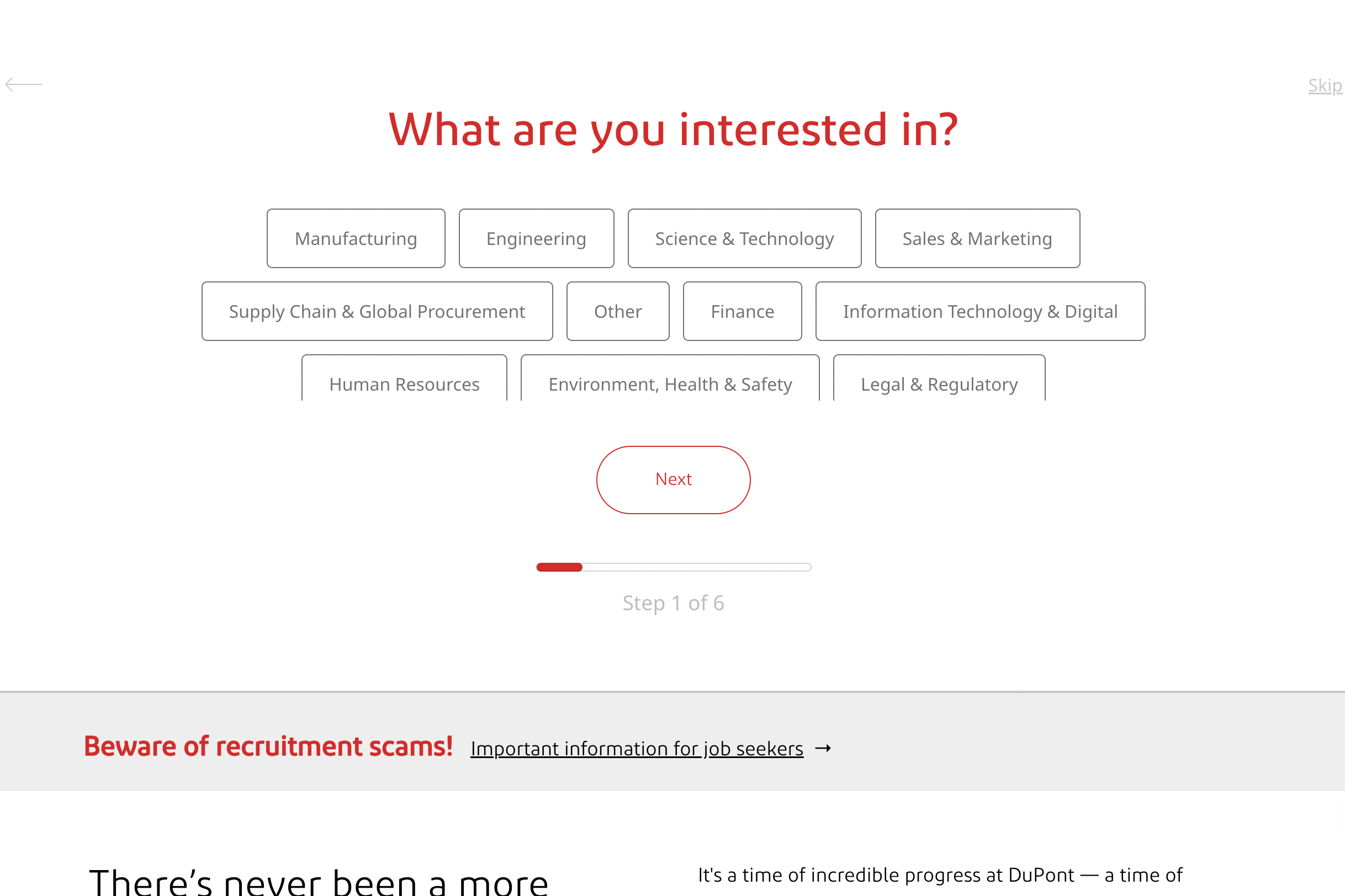
⸺ Analysis.
Perhaps DuPont has assumed that users won’t want to take the extra step and sign into one of their social accounts, because they provide the option of bypassing this step and clicking that gray button in the top-right: “Skip.” If the user clicks it, the screen to the left appears. Oh, boy. Take in all of those options. The user has traveled through four screens, only to realize that she has only arrived at “Step 1 of 6.” We can assume that, by now, she is thoroughly annoyed.
⸺ Recommendations.
Consider making two tunnels starting on the Careers page for two types of job-seekers:
- Candidates browsing positions.
- Candidates who want to sign up for updates, share their resume, and reveal more about their career interests.
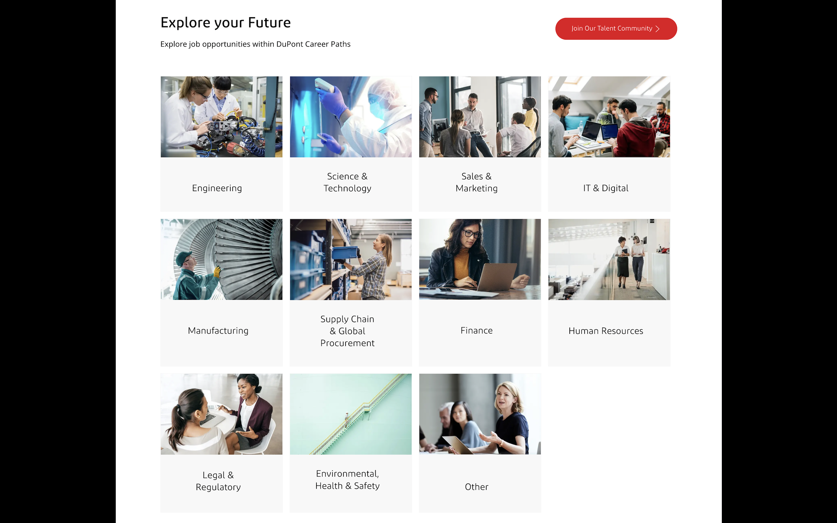
The biggest irony of that rabbit-hole that we just tumbled through is that the user can find a perfectly sound layout further down the page:
⸺ Analysis.
Voilà. On one hand, this layout looks tiled and HTML-y. Yet it likely offers the best experience for someone looking for a job at DuPont. The user already knows that DuPont is a renowned house of brands, so she doesn’t need to be wooed while she’s applying for a position. This grid conveys the major job categories at DuPont — communicating all of the choose-your-own-adventure steps in a single screen.
⸺ Recommendations.
Streamline those tangled journeys into a layout that divides the company into subcategories that job seekers can easily browse. After that, DuPont can set up sign-in pages, “Join Our Talent Community” subscription options, offers to receive their job openings newsletters, and lists of job postings. Only after you earn the user’s trust can you make the experience more layered and intricate.


Corian Sites.
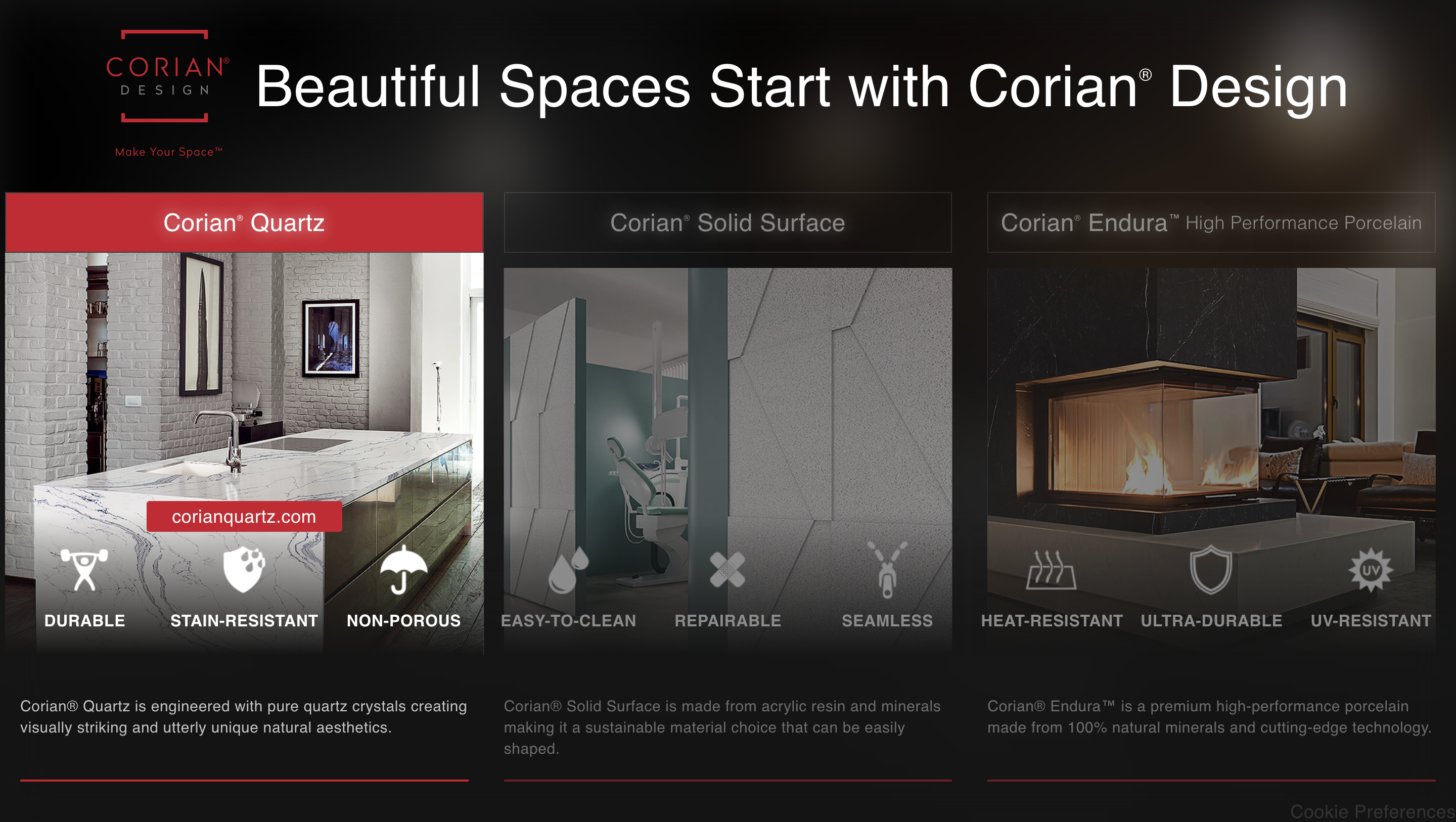
“Corian” is the name of one of DuPont’s internal brands. They specialize in solid surface materials typically used in installations like sinks and countertops — quartz, marble, granite, porcelain, and wood. The three sub-brands of Corian are “Corian Quartz,” “Corian Solid Surface,” and “Corian Endura.” DuPont referred us to a brochure site that housed all of those sub-brands under one domain, “na.corian.com”:
⸺ Analysis.
But here’s the rub: Those three sub-brands of Corian each have their own domains. So now you’ve got a main site that links to three different sites. And when we started working on this project, the domain for Corian Quartz that appeared in the SERPs routes the user back to this overarching Corian Design site rather than Corian Quartz.
⸺ Recommendations.
Untangling those URLs and fixing associated SEO issues was the first problem that we noted in our audit of Corian. Our advice? Consolidate the Corian products into a master site that organized the information more efficiently than a brochure site with three doorways that tumble users into interrelated yet separate domains.
Corian Endura.
Corian Endura is Corian’s porcelain brand. The example below is the most telling instance of slipshod UX that we found in our audit of Corian Endura. The homepage has been updated since we consulted with DuPont, but when we analyzed it, this is how the hero appeared above the fold of Corian Endura’s homepage:
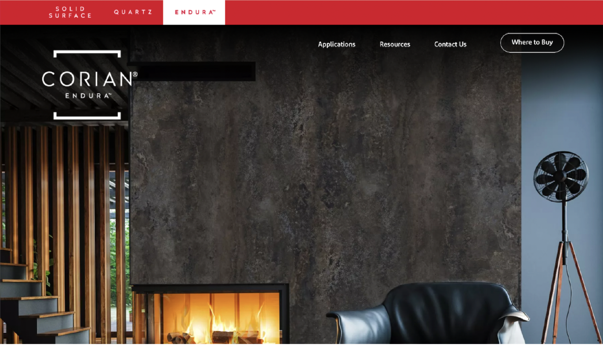
See this space here? This is the fold. In the instant that the user lands on the page, she cannot see any of this. She can only see the blank wall of a fireplace, the crackling logs, a fan and the top half of a leather chair. That’s it. Why?
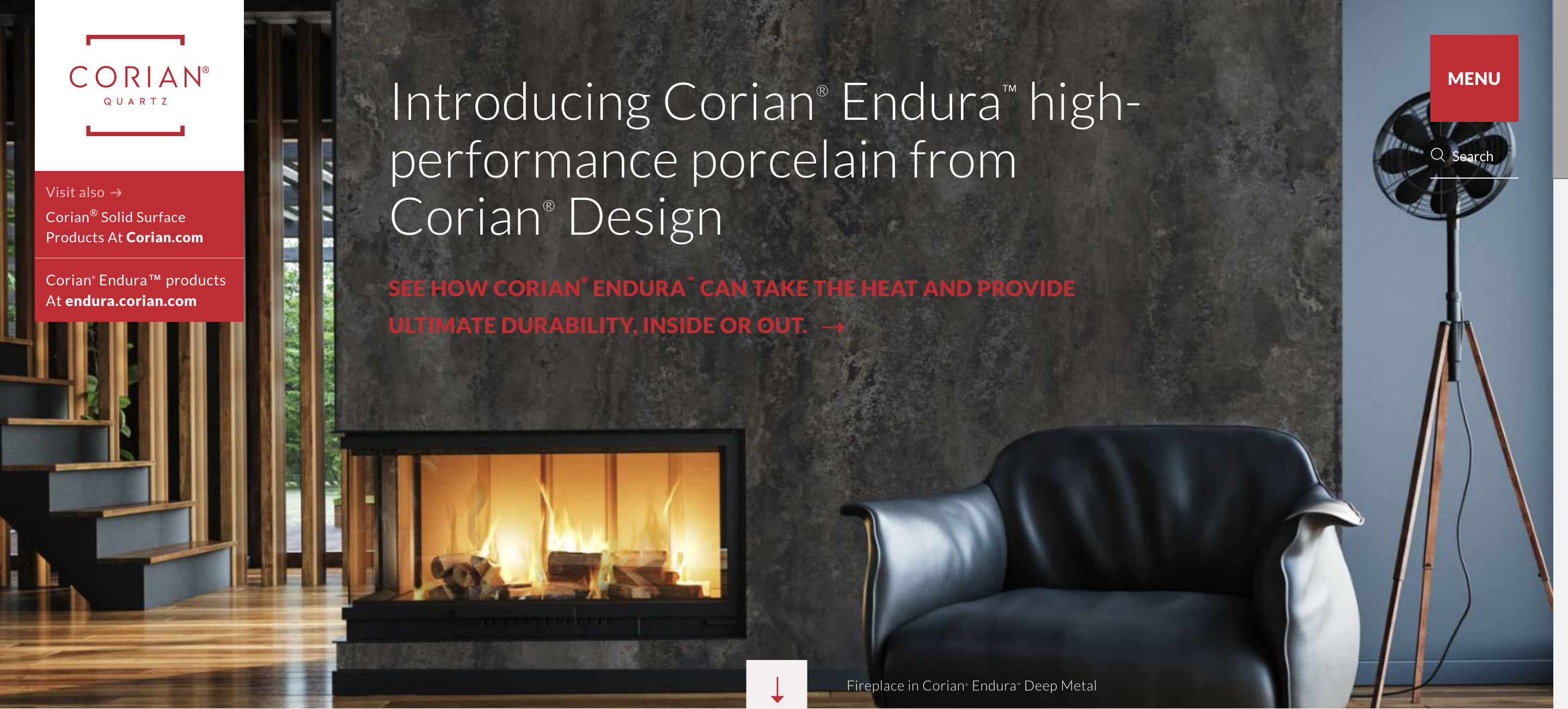
Because the messaging intended to accompany this image is buried below the fold:

⸺ Analysis.
The lack of relevant messaging above the fold fulfills the illusion of completeness. Most likely, it deceives the user into thinking, ‘Nothing to see here. I’m leaving.’
⸺ Recommendations.
Move the copy up so that the user sees a hierarchy of messaging the instant she lands on the page. Otherwise, it feels like a hotel without anyone behind the front desk.
Corian Quartz.
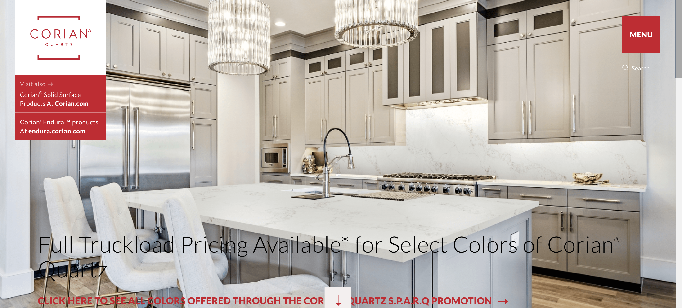
The hero section of the Corian Quartz site was also a problem. The first thing that the user sees is a carousel of images that feel disjointed. Take a look at the slides one by one.
⸺ Analysis.
The hero image is bright, clean, appealing. Yet the canvas lacks a focal point. The typography is jammed into corners and fading into the background. (Look at the bottom left. “Quartz” disappears into the shadow beneath the fridge.) A line of red type and arrows are jumbled up at the bottom of the screen. The copy isn’t structured into a hierarchy, so the eye doesn’t know which message to read first.
⸺ Recommendations.
Structure the copy into a hierarchy. Make the typography legible. Simplify the messaging. Grab the user’s attention with a single CTA.
⸺ Analysis.
This screen appears to be laid out well. The typography is legible. Yet questions remain:
- Didn’t users just come from the Corian Design brochure site that asked them to choose between Corian Endura, Quartz, and Solid Surfaces?
- If so, why are they being routed back to the Endura site from the Quartz site?
⸺ Recommendations.
All the Corian Design options seem linked. Why chop them into different URLs? Consolidate the content into one Corian site.
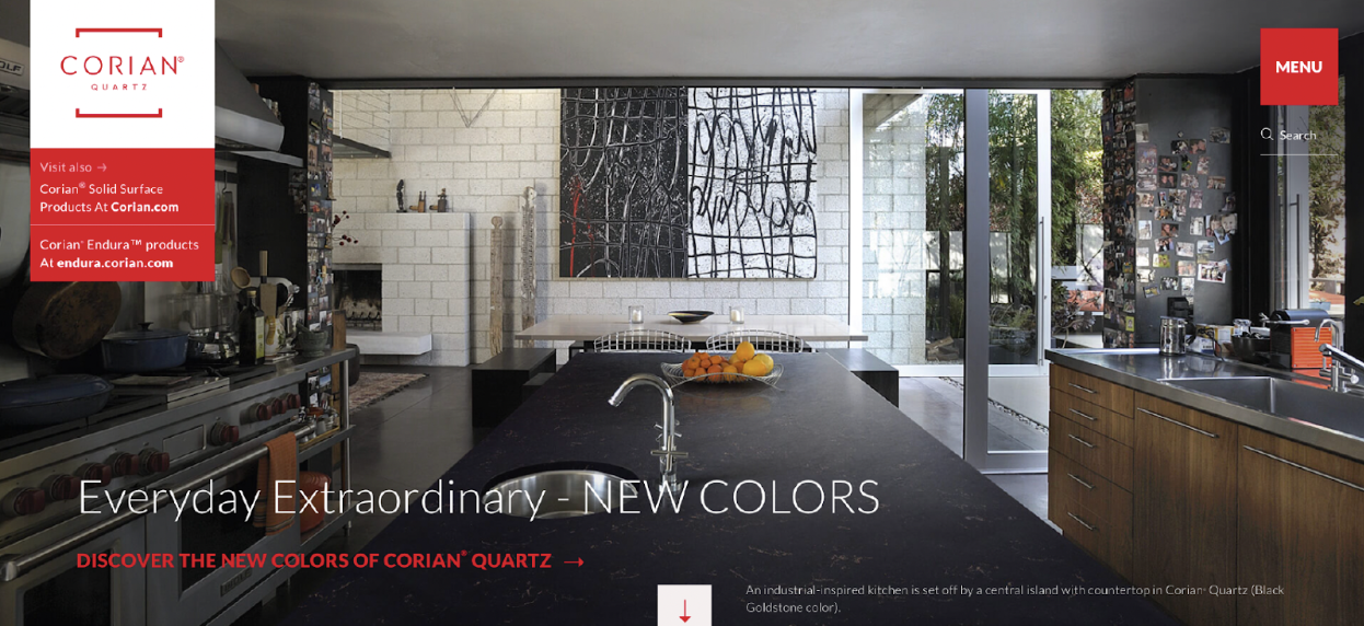
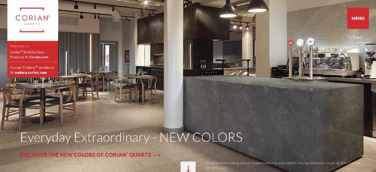
⸺ Analysis.
Per usual, these layouts are busy with text, yet that text is pushed toward the bottom of the screen. And since this is a carousel, the user is under pressure to piece together the messaging in a few seconds. The hierarchy is so disjointed that anyone could be forgiven for reading the page like this: ‘New colors … discover the new colors … what’s that white copy say at the bottom? Wait — where’d the slide go?’ before it fades into Slide 4. Once she arrives to Slide 4, the user might think that she’s still on Slide 3, because the copy is virtually the same. The only difference is the captions in the bottom right of the canvas. But users don’t have time to read that, since this is an autotimed carousel rather than a gallery that users can click through.
⸺ Recommendations.
Unless these two slides are accomplishing distinct goals, consolidate them into one slide. Create a typographic lockup in the center of the image. Or move around the elements to create some type of visual focal point. Switch out the H1 for something that feels more measured than “NEW COLORS.” Make sure the copy is legible on such a busy background. And cut the captions.
Top-level insights.
All of the notes that I took on Corian Quartz cohered into a few recommendations for how to ameliorate the poor user experience. Here’s a sampling of those recommendations.
Structure the messaging.
Reformat the copy into hierarchies so the user can identify the headline, the subcopy, and the CTA. Standardize the typefaces and colors.
Add signifiers.
Use indicator dots or other signifiers to give the user an idea of how many slides the carousel has and how long it takes each slide to fade in and out.
Rethink the journey.
Too many messages clutter up these slides. Other links route the user out of the site. Untangle all the copy. Focus on where you want the user to go.
Outro
Audit complete.
The presentation of our UX suggestions to DuPont signaled the close of this account. We never heard, definitively, whether they would implement our suggestions or not. But shortly after we submitted our analysis to them, the hero of the blank fireplace on the Corian Endura site changed to a video embed with a clean hierarchy of messaging structured above it. So we hope that our analysis helped DuPont prize clarity and simplicity over clutter and ornamentation.
