Kick It California
Kick It California (KIC) is a well-known website that helps Californians quit smoking or vaping. KIC had turned their website into an app, “NoButts,” but they asked us to reconceptualize the entire user journey.

Self-guided app, premised on cognitive-based therapy.
Year
2023–24
Services
UX Copywriting
Content Strategy
Information Architecture
Client
Kick It California
Judgment Level
Nonexistent
Overview
Let’s kick it.
In 1992, researchers at the Moores Cancer Center at UC San Diego Health launched Kick It California. (Or “KIC,” as we termed them internally). By the time they came to us in 2022, KIC was a respected public resource. Californians trying to quit smoking can access the site to phone, text, or chat online with a quit coach. These professionals are trained to help people quit through advice rooted in cognitive-based therapy (CBT), a treatment approach intended to help with ADHD, anxiety, eating disorders, and substance abuse disorders, such as smoking and vaping.
KIC enlisted our expertise because their users were drifting away from call support toward apps, and “NoButts” was not competing well with more polished apps in this domain. They needed to reimagine the user journey with habit trackers and behavior modification interactivity designed to appeal equally to older and younger demographics, who preferred individualized digital experiences built with enough gamification to motivate them through such a difficult undertaking.

Objectives.
Turning the website into an app posed an intriguing challenge. So much of KIC’s site was based on connecting smokers with quit coaches, whereas any app would be inherently more self-guided. That meant realigning the UX with principles of CBT, rather than building a digital funnel chuting users from sign-up to sale. These were the objectives that the client wanted us to hit:
Redesign the "NoButts" app.
Develop new branding that users would find easy to navigate. (Colors, copywriting, typography, plus other foundational visual elements.)
Conduct a mobile app survey.
Collect feedback on the app during development. Analyze quitting outcomes after users uninstall the app to help us refine the experience.
Boost enrollment intake.
Make the app into a digital tool that users would want to open because they trust it enough to input some of their most vulnerable health concerns.

Who’s the user?
KIC told us that their audience was “anyone addicted to smoking cigarettes.” Yet they intended the app to primarily serve two categories of smokers and vapers:
- Quit-ready: Users who have quit but relapsed.
- Quit-curious: Users who want to quit or planning on quitting.
⸺ Age.
Phone-coaching audience tends to be older. Online audience skews younger.
⸺ Education.
Graduated from middle or high school but did not pursue higher education.
⸺ Income.
Generally lives under the poverty line. Comes from lower-income households.
⸺ Health.
Struggles with issues like diabetes, poor vision, gum disease, high blood pressure.
The faces behind the numbers.
KIC shared this data with us because they wanted us to understand that the process of quitting is subjective and personal. Our goal was to convey a type of therapy that can adjust behaviors and motivate someone to accomplish a task often seen as impossible. Even the client admitted that they could strike a tone that could come across as clinical or academic. So they asked us to check their writing for instances that seemed as if they viewed the people using their app or phone service as test subjects or data-sets. They urged us to speak to their users in a voice that felt nonjudgmental and empathetic.
App Approach.

After learning more about our audience and cognitive-based therapy, we built three main UI pillars supporting the app’s functionality:
01.
Quit plans.
We wanted the app to help users develop a quit plan tailored to their triggers, smoking history, and motivations to quit.
02.
Coping with stress.
Relapses are common during the quit journey. So we wanted to give users the opportunity to chill out with distraction games and breathing exercises and other activities that helped them re-center.
03.
Reinforcing behavior.
Retention, repetition, reflection — these were the core components of the app. We tried to engage and re-engage users through daily missions, celebrations of their successes, and offers to work with a one-on-one coach. All those tactics urged users to stay motivated on their quit journey.

Navigation Approach.
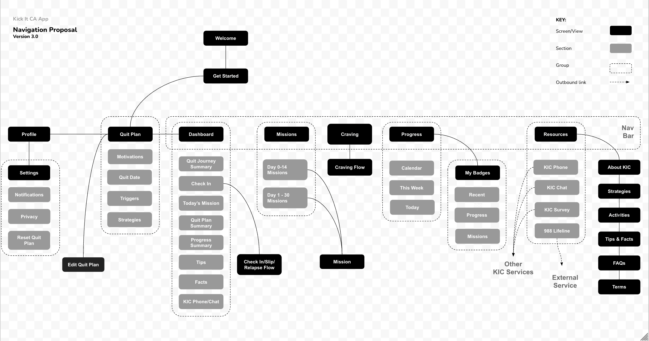
We pitched a number of navigation proposals to the client. They selected the one below. We also included Progress and Resources in the navigation elements, plus standard options in the bottom tab bar. (About KIC, Strategies, Activities, FAQs, Terms & Conditions.) We felt that this was the most simplified version of the user journey.
User flow
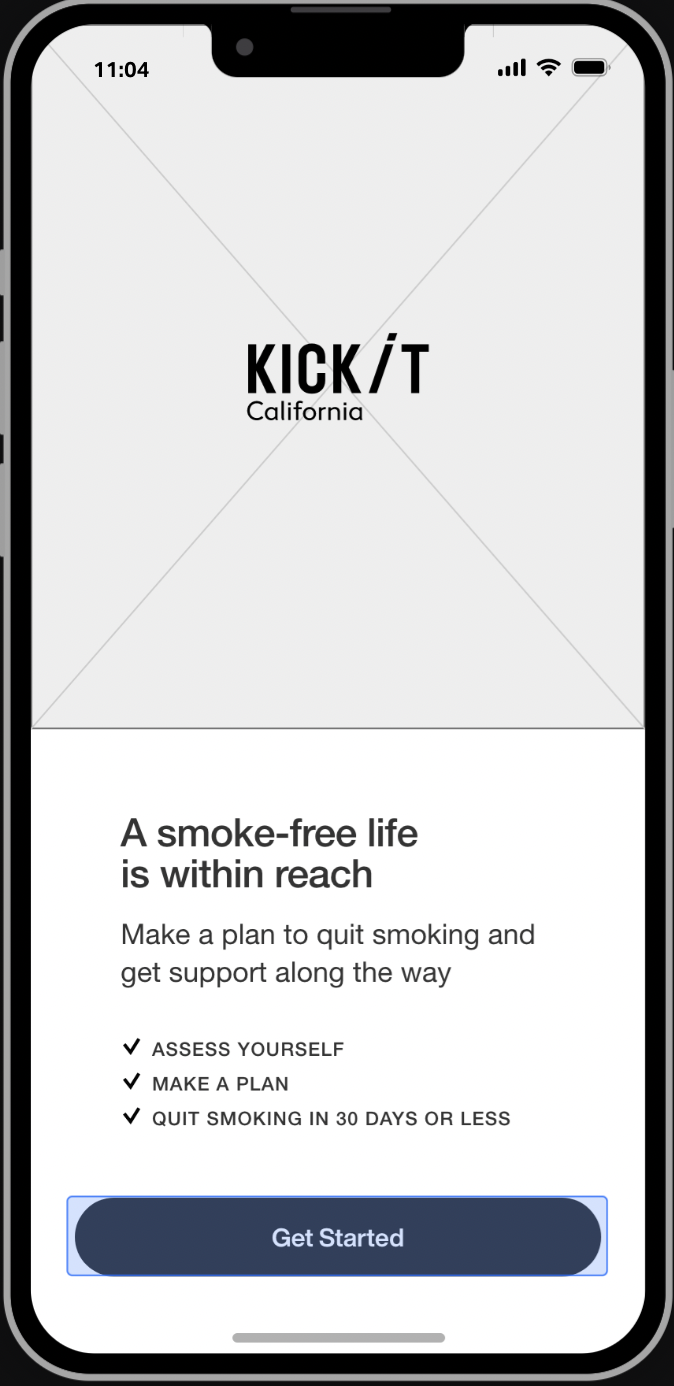
A welcome screen with a sign in function greets the user. Allows her to specify what she wants to be called in the app.
A mini-assessment asks the user how many cigarettes she smokes, how much money she spends on cigarettes, whether she’s preparing to quit or whether she’s already quit, and so on.
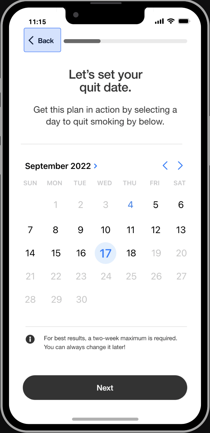
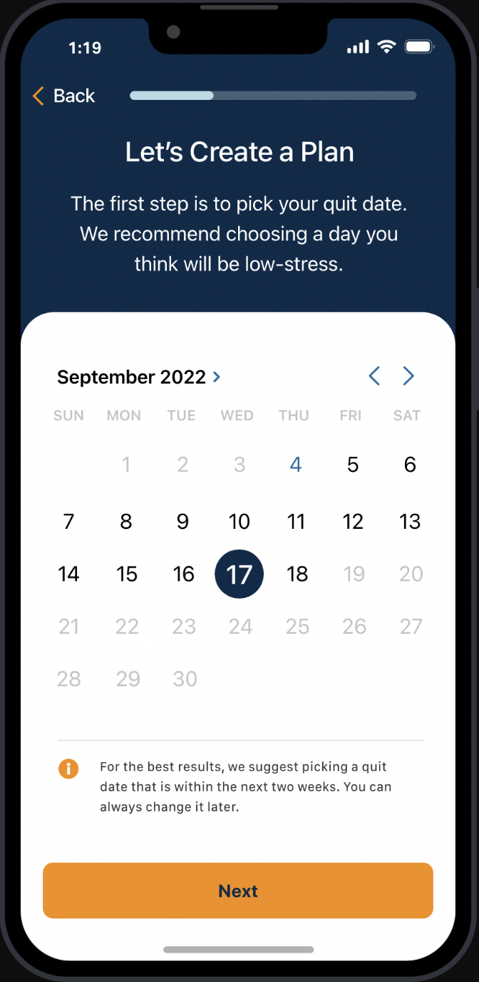
Each quit plan is personalized to each user, allowing her to schedule a quit date that she’s comfortable with and reset that date when she has a slip or a relapse. Each quit plan also identifies triggers and offers coping strategies.
Users can check in, engage in the mission of the day, access their progress summary — figuring out how many days they’ve been smoke-free and how much money they’ve saved during that time.


Missions.
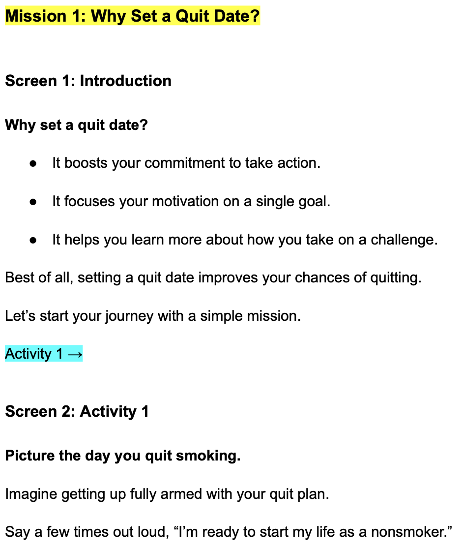
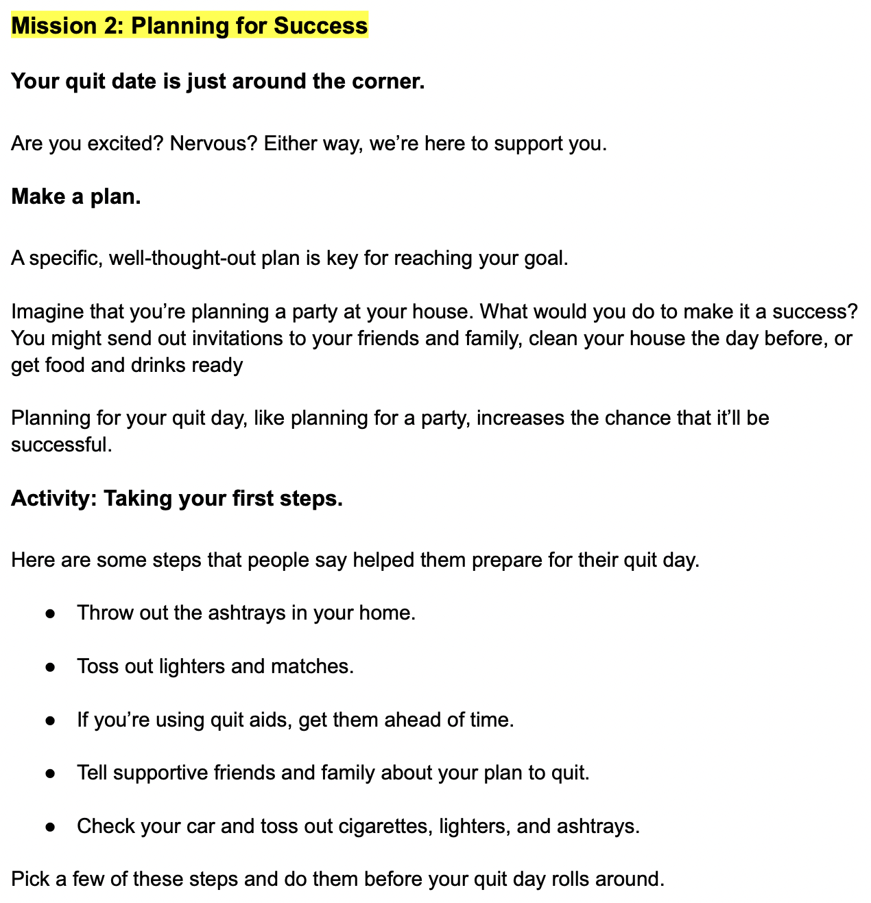
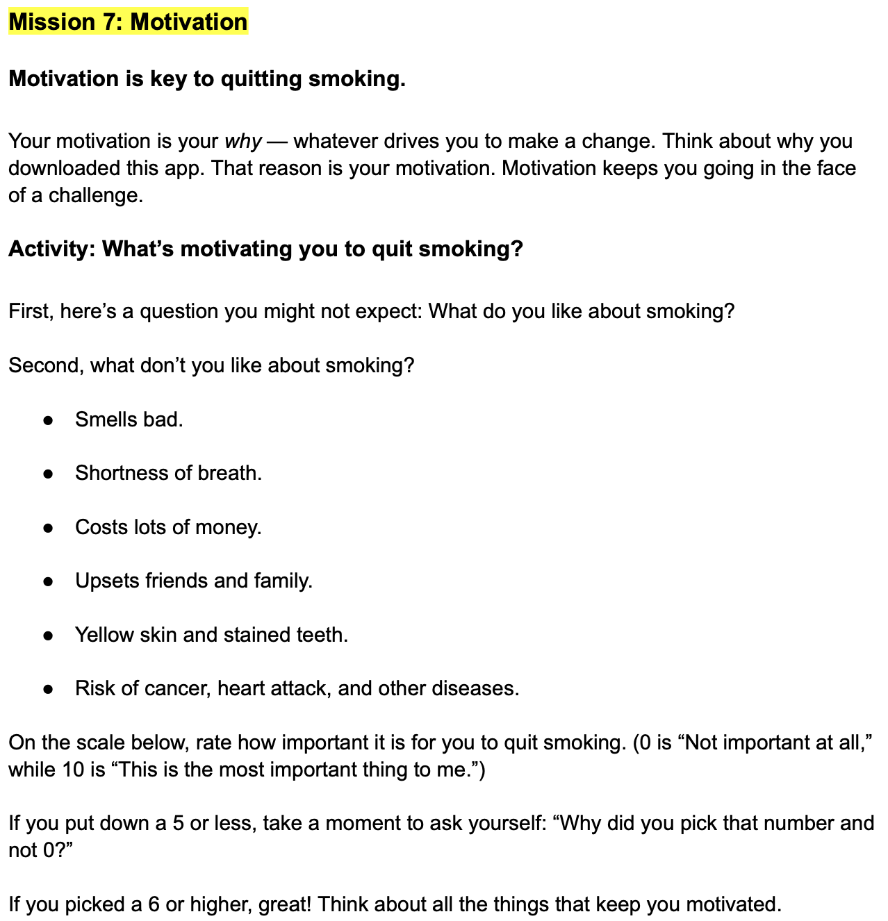
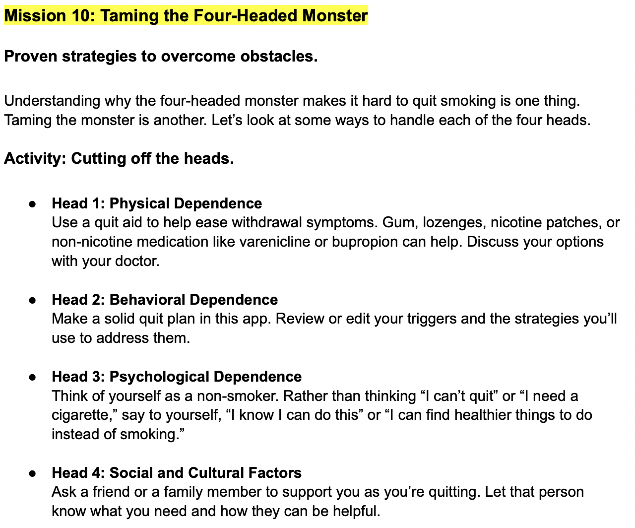
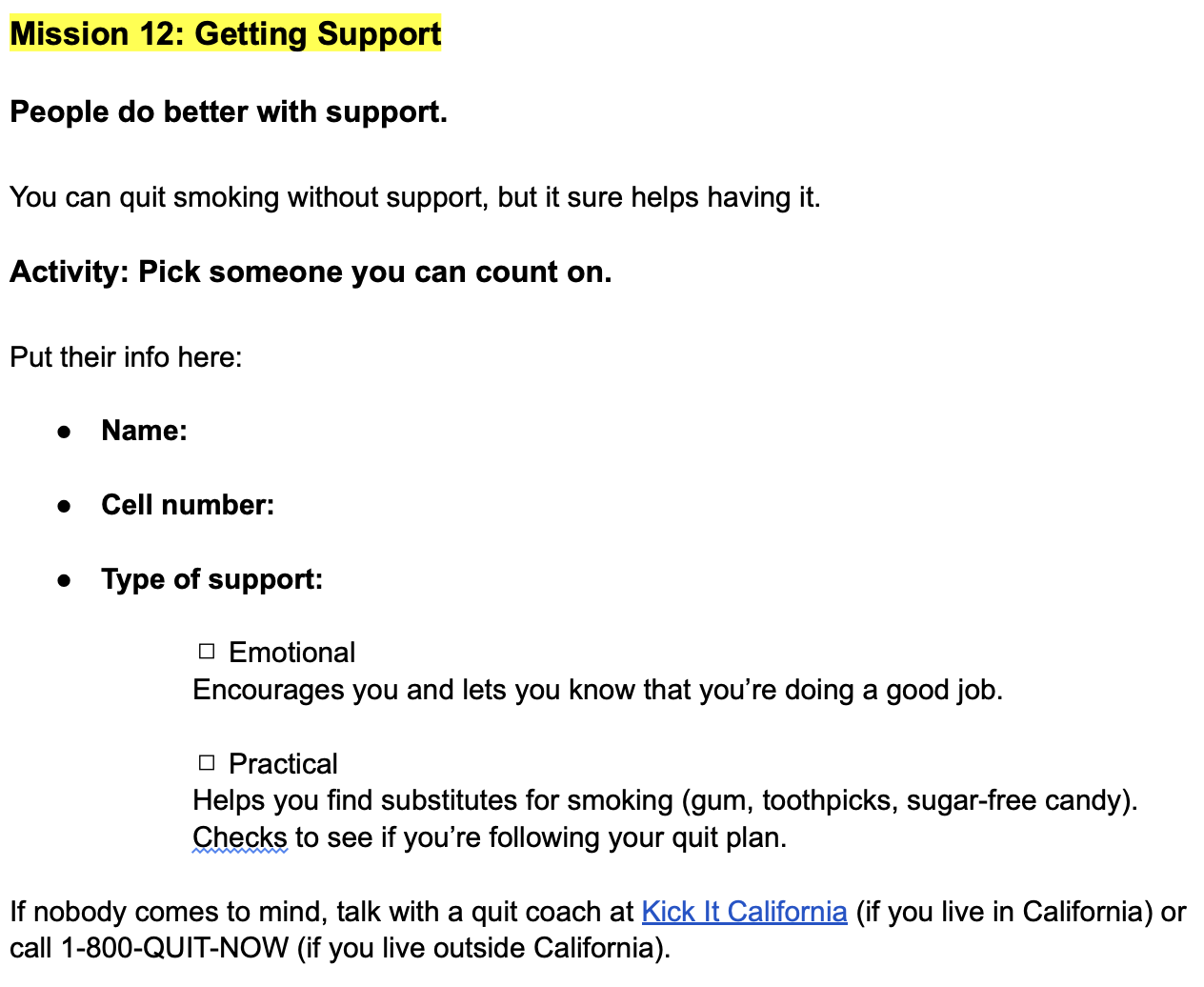
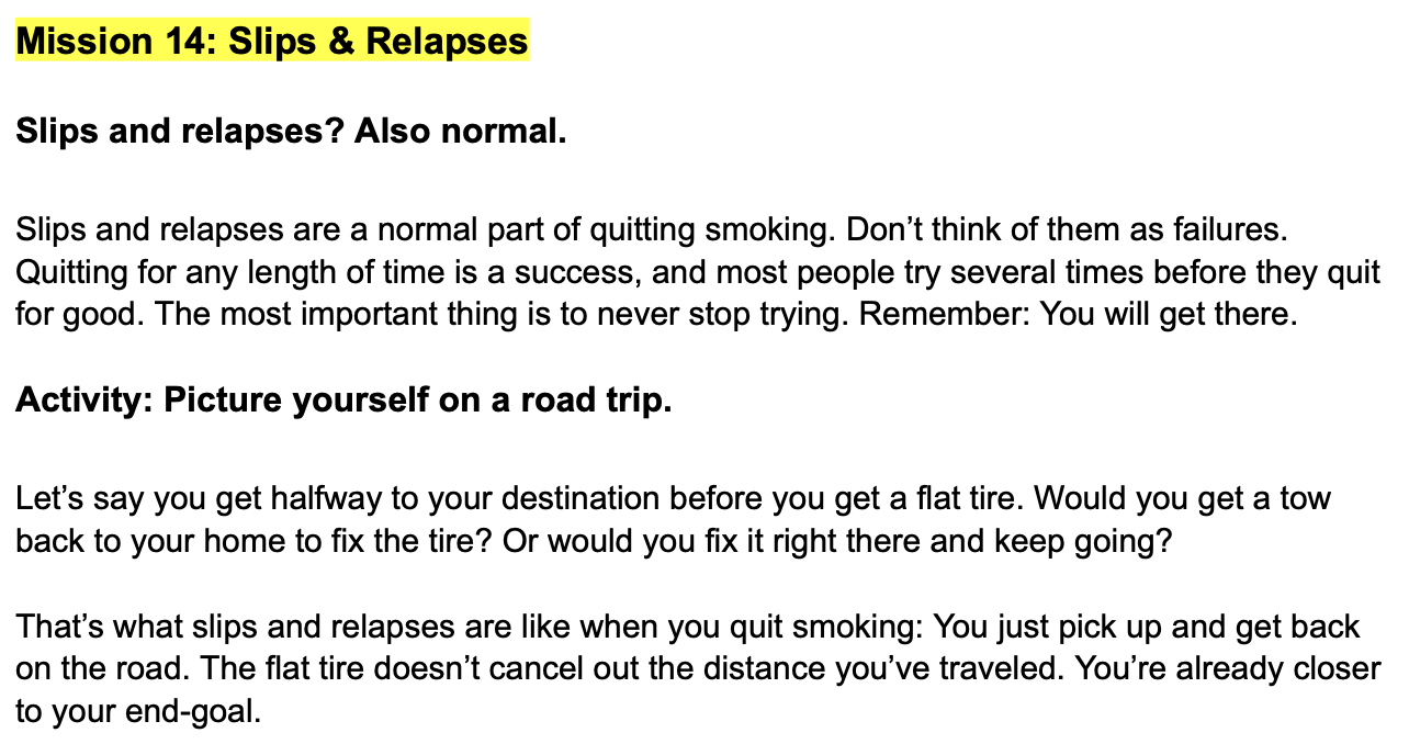
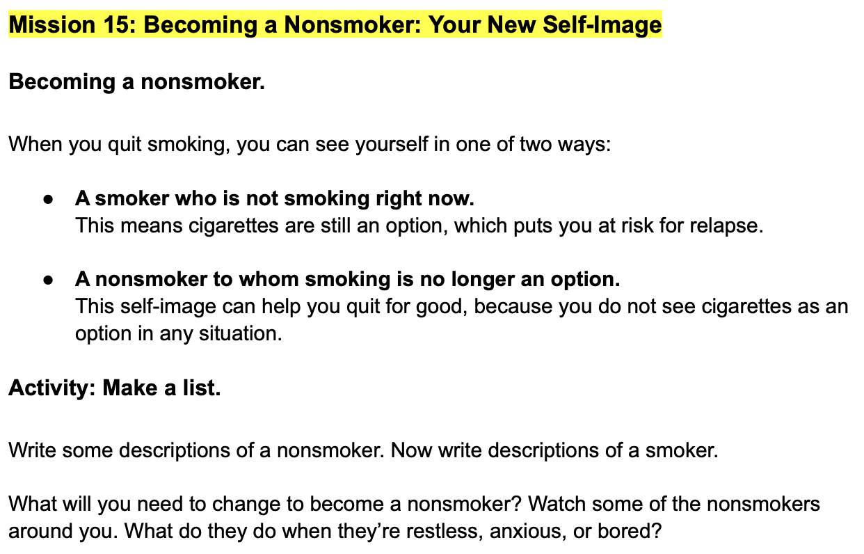
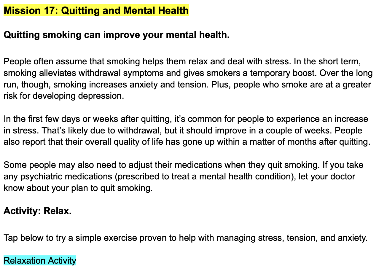
The feature of the app that I worked on the most was the daily missions — prompts that took 3–5 minutes to complete. The missions helped users identify the reason they wanted to quit smoking. They focused on topics like triggers, why quitting is so hard, how to forgive yourself for relapsing, and how quitting smoking improves your mental and physical health. Daily Mission Reminders nudged users to open the app at a frequency consistent with a relapse-sensitive schedule, which we sent at noon and 6 PM every day, including weekends and holidays.
⸺ Welcome Text.
Immediately after sign-up.
⸺ Pre-Quit Day.
Daily.
⸺ Week 1.
Twice daily.
⸺ Week 2.
Daily.
⸺ Week 3.
Two per week.
⸺ Week 4.
One per week.
⸺ After One Month.
One per week.
⸺ Up To Six Months.
One per week.
Flow overview.
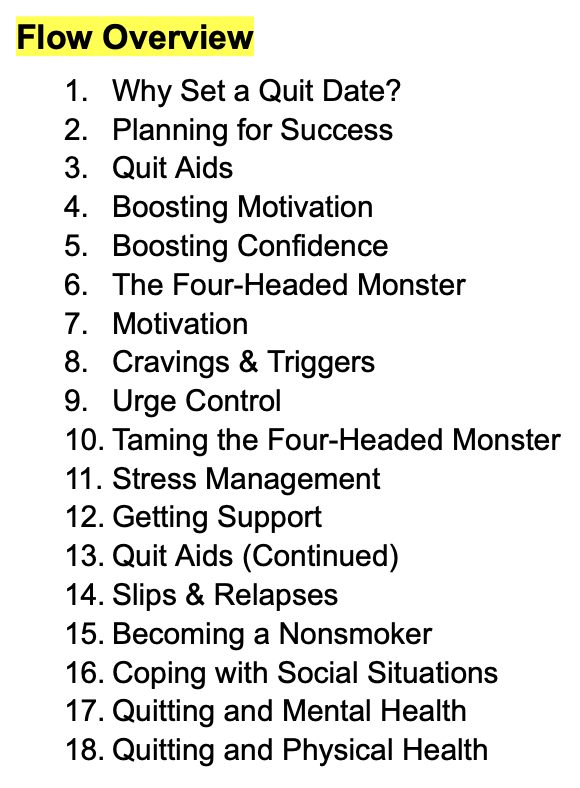
Since the missions often led to activities that reinforced CBT techniques, we didn’t want them to progress in a linear trajectory, the way you might read a book. Look at the snippet titled Flow Overview in the carousel below.
- Notice that “Quit Aids” first appears in Mission 3 and then again in Mission 13.
- Or that “Boosting Motivation” appears in Mission 4 and again in Mission 7.
We staggered out those chunks of information because we felt that users needed smaller doses of motivation sprinkled throughout their journey. I edited the copy to feel clean and simple. I read it out loud to make sure that any text-to-speech functionality made sense to anyone using a Screen Reader. Check out the individual missions below.
Wireframes & Design.
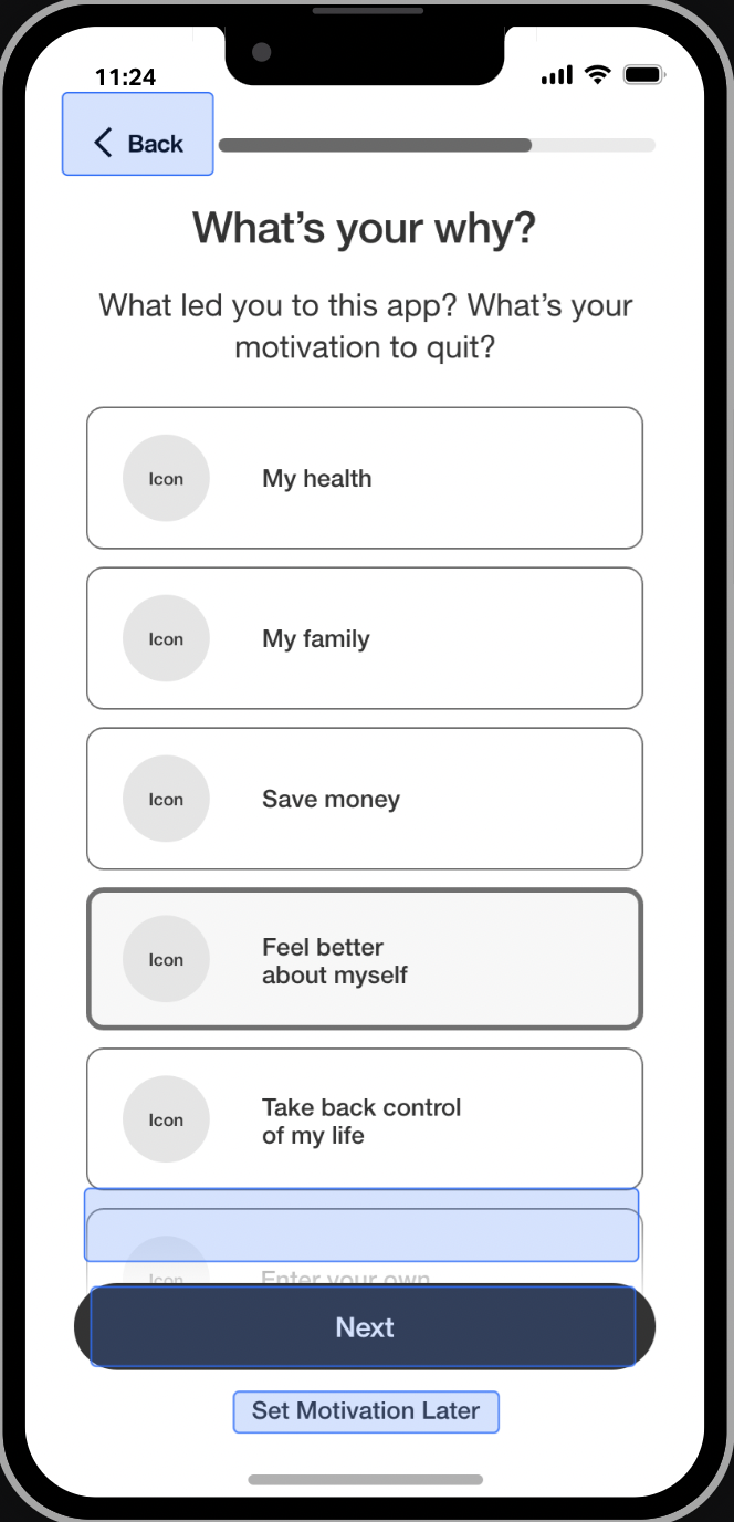
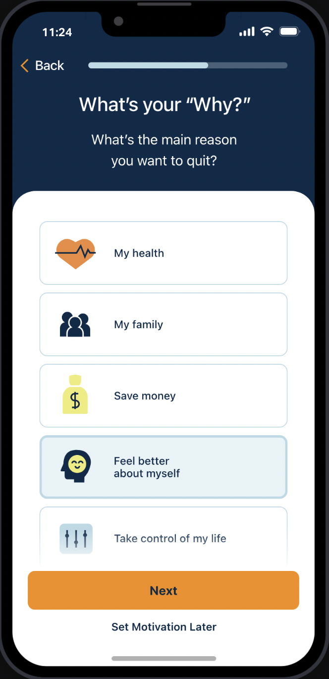
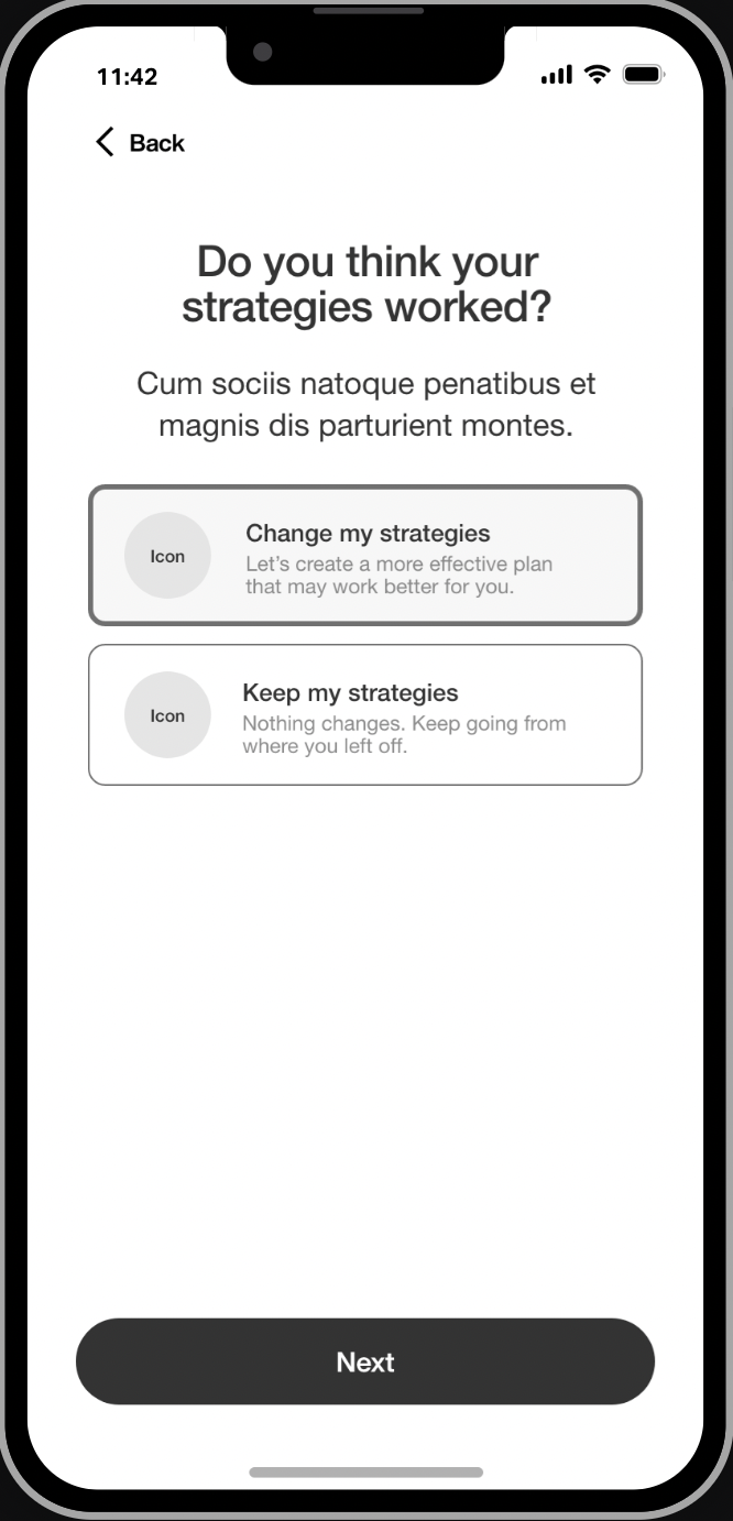
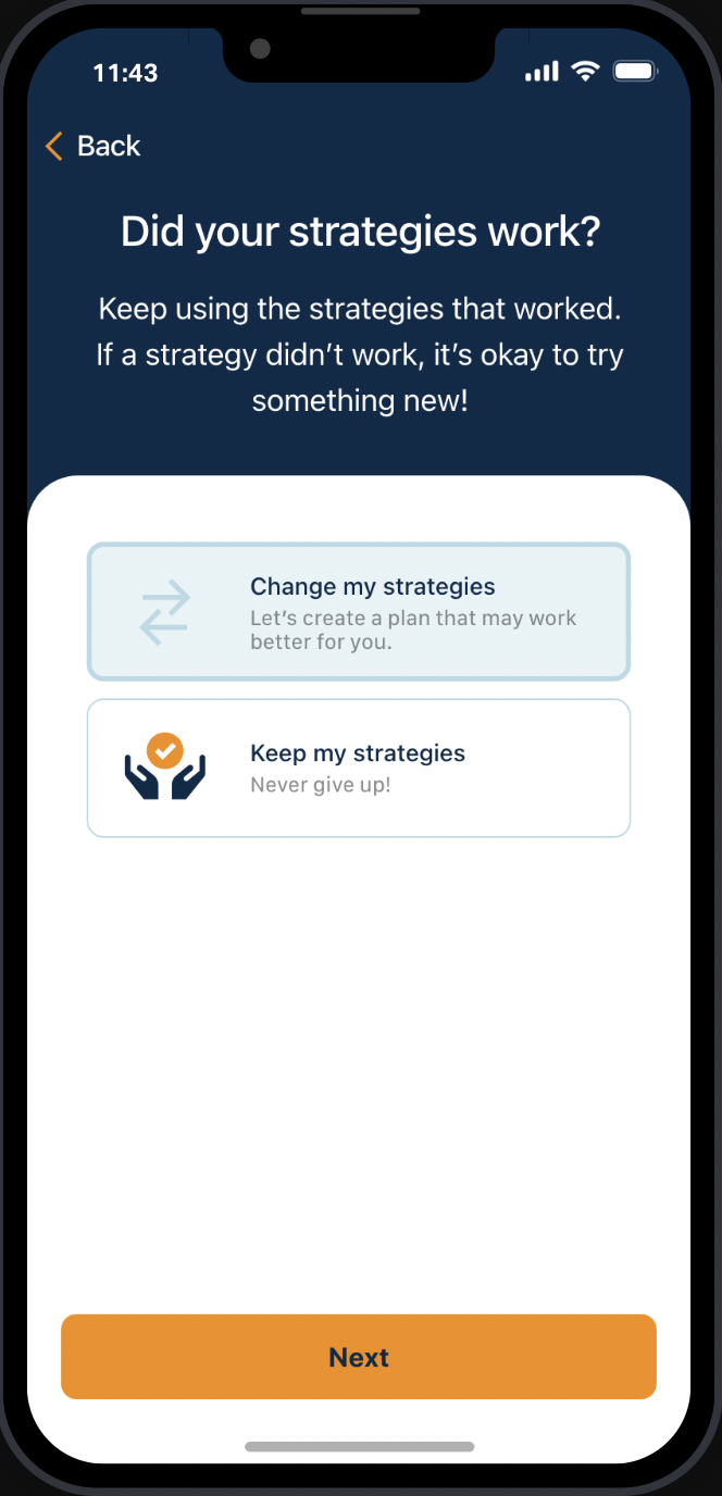
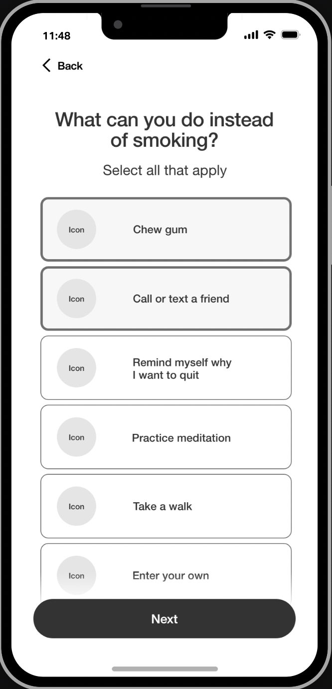
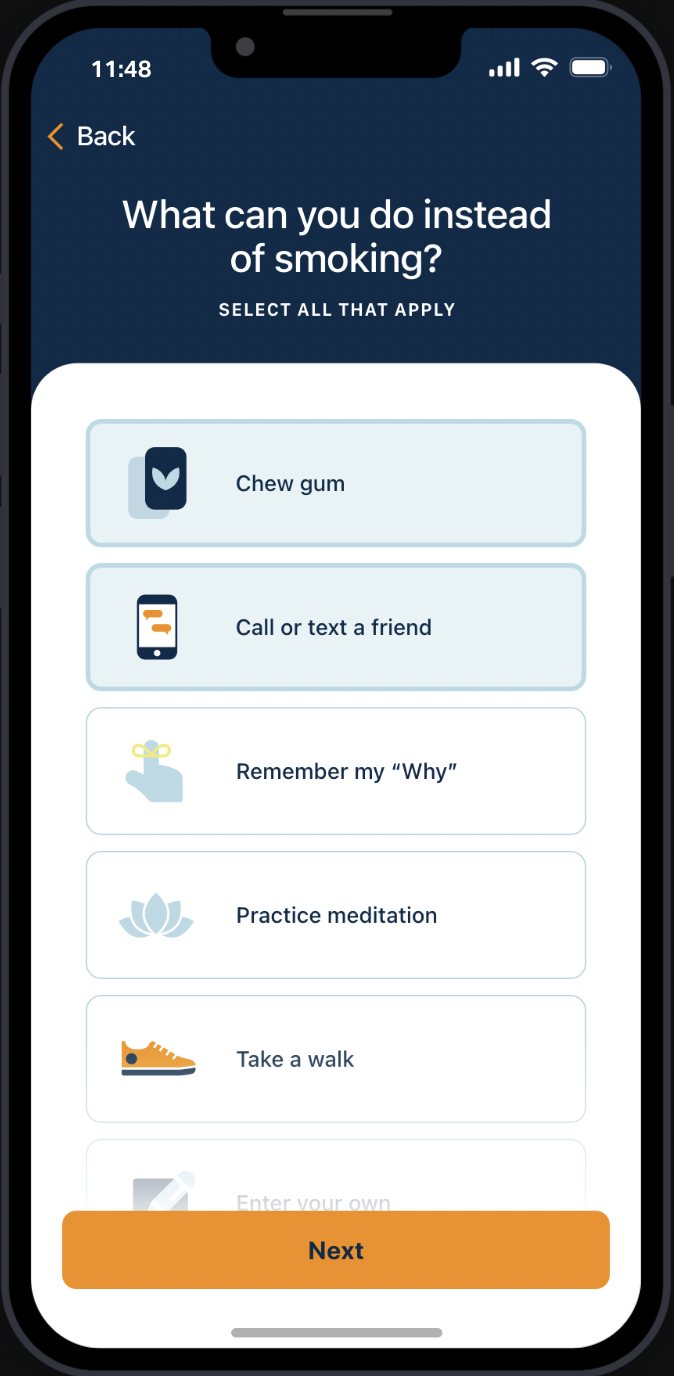
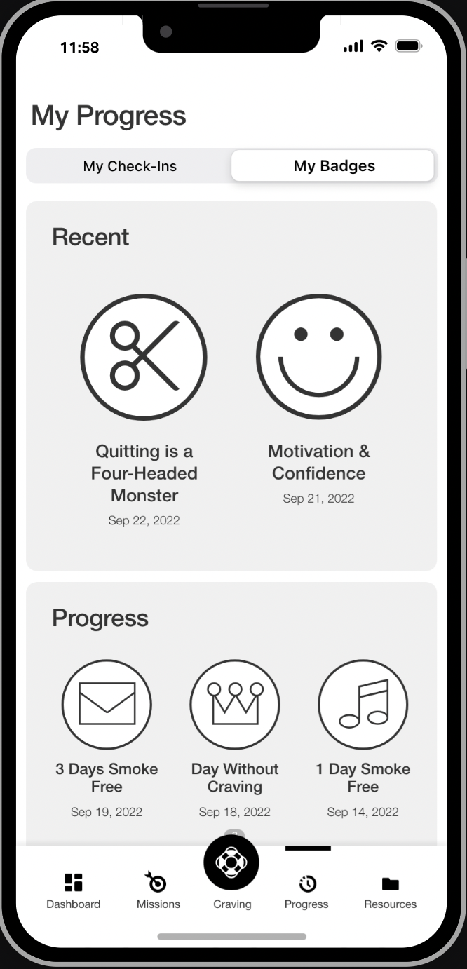
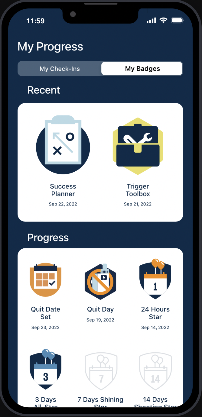
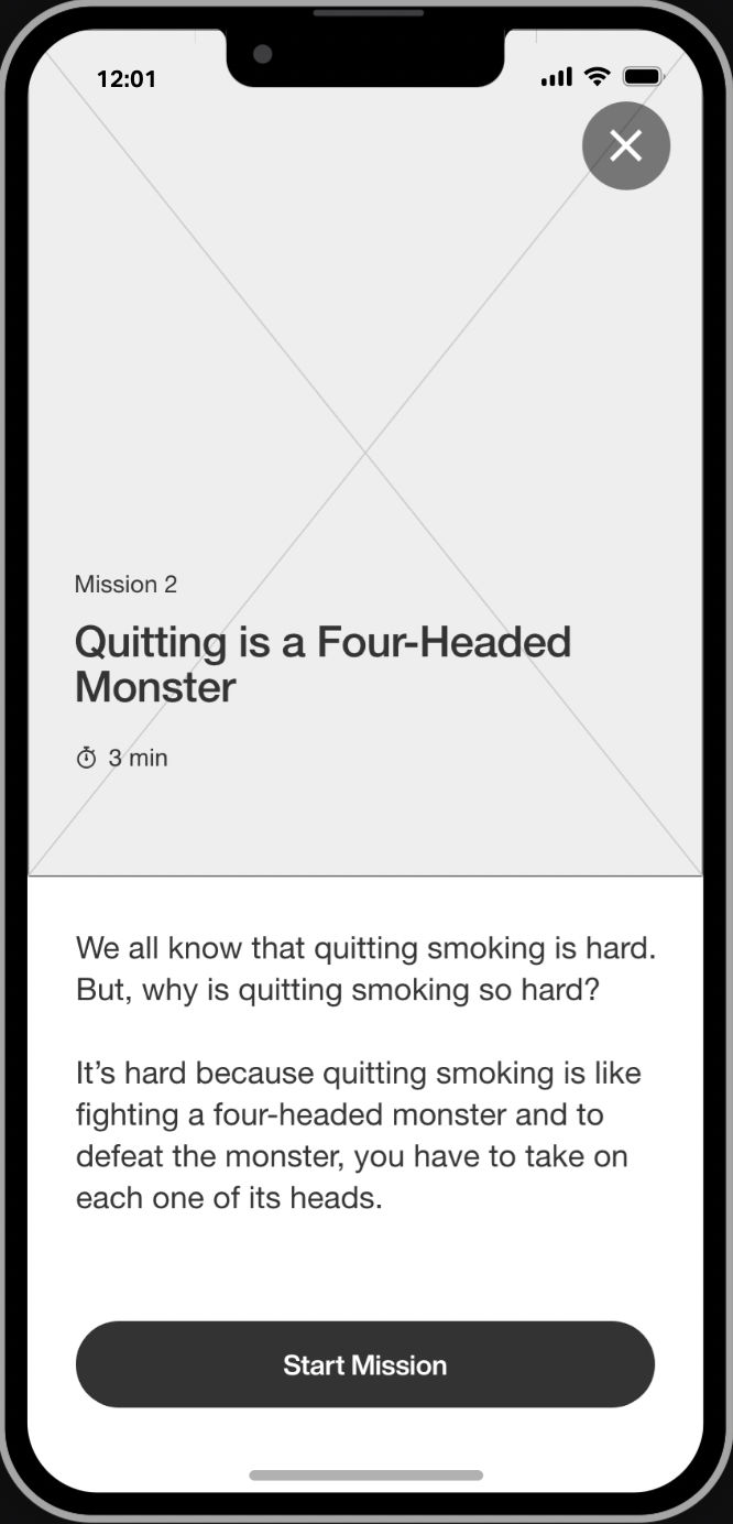
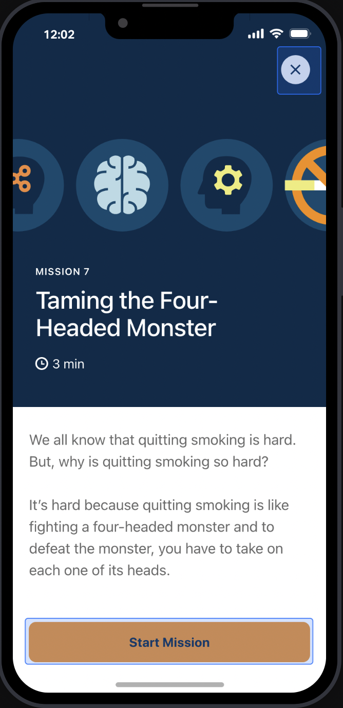
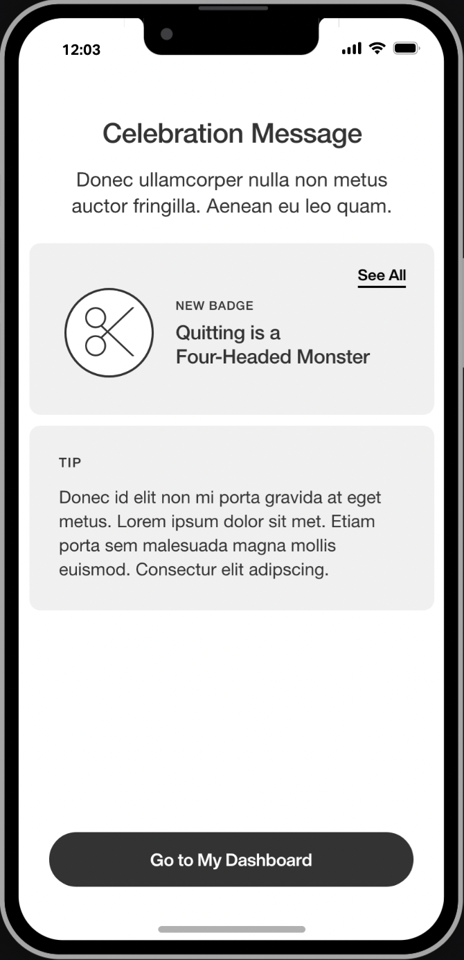
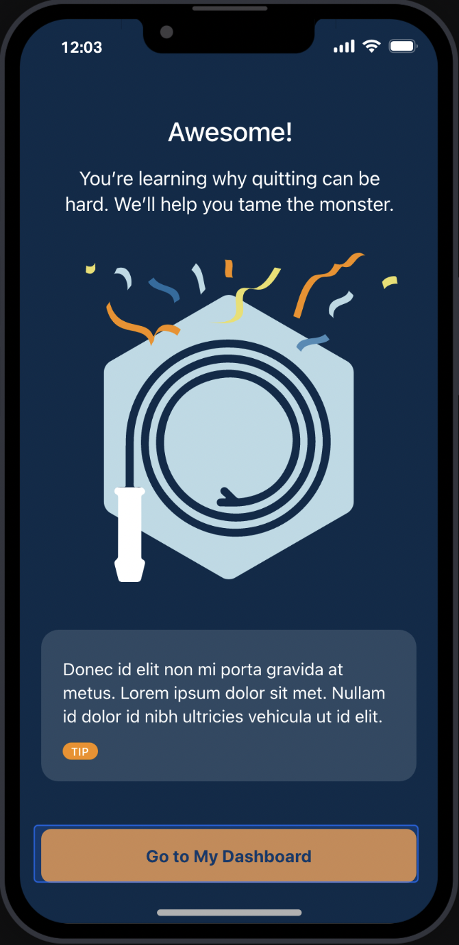
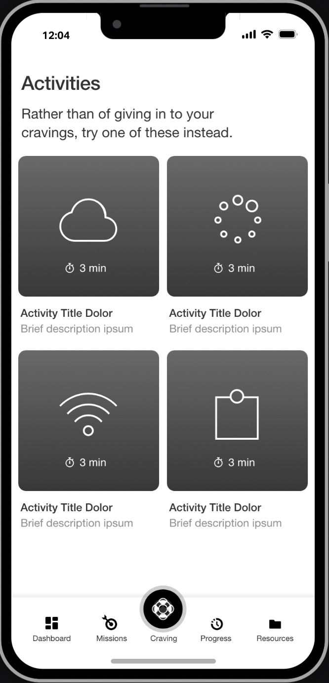
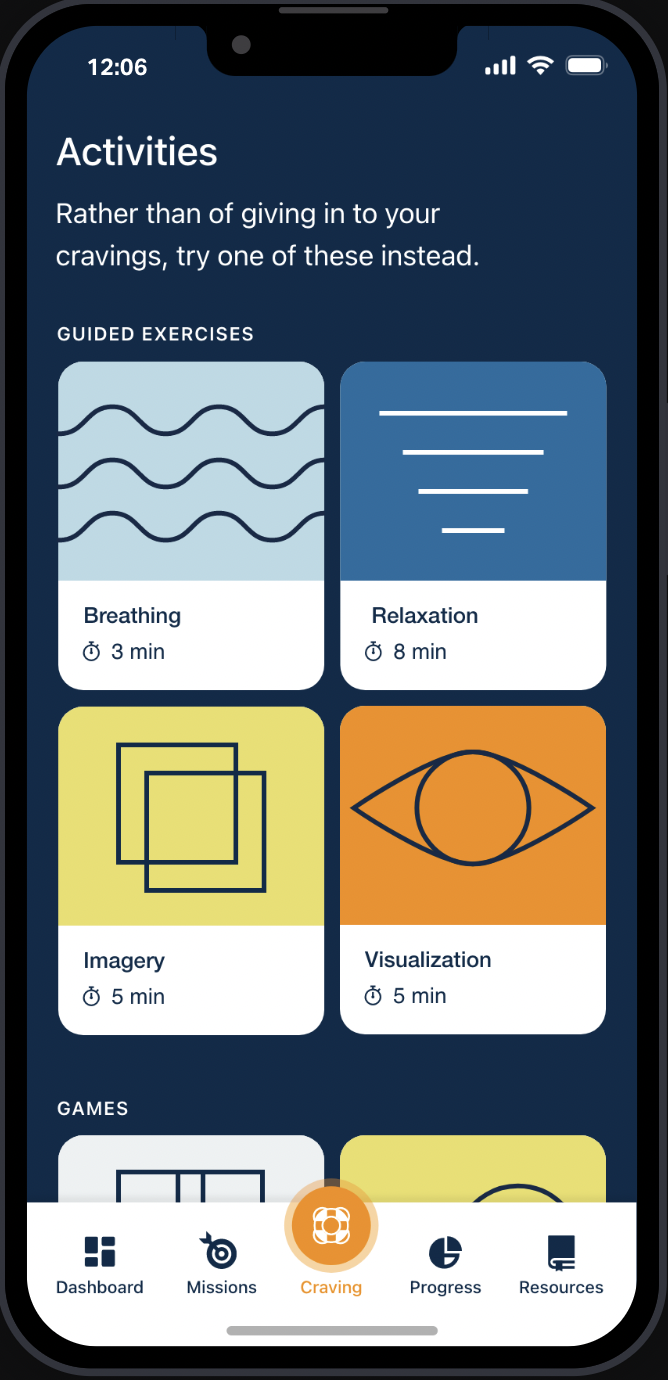
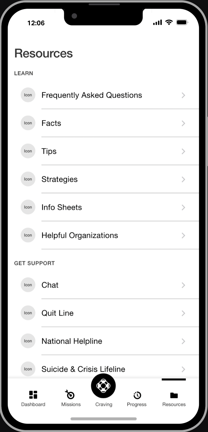
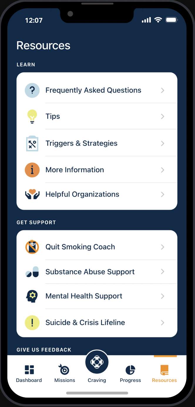
After the client approved the copy, we wireframed the app — the welcome page, stress management tips, a progress tracker, additional resources, and so on. In the module below, toggle the before-after image slider back and forth to view how the designers transformed the wireframes into the final screens, which came together beautifully.
01.
Welcome.
02.
Quit Date.
04.
What’s Your Why?
07.
1 Day Smoke-Free.
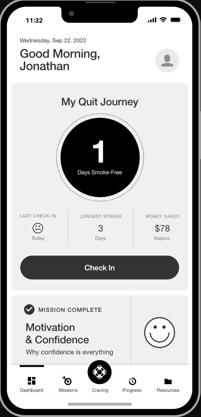
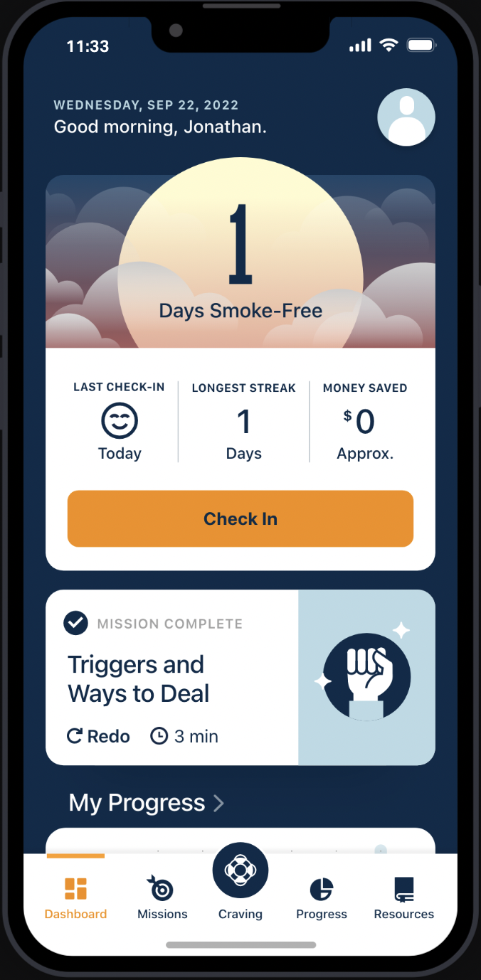
09.
Slip-Relapse.
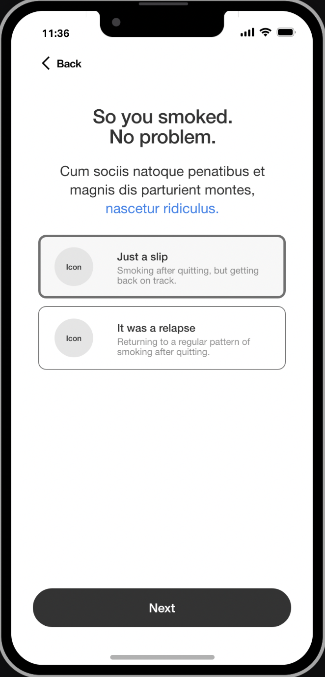
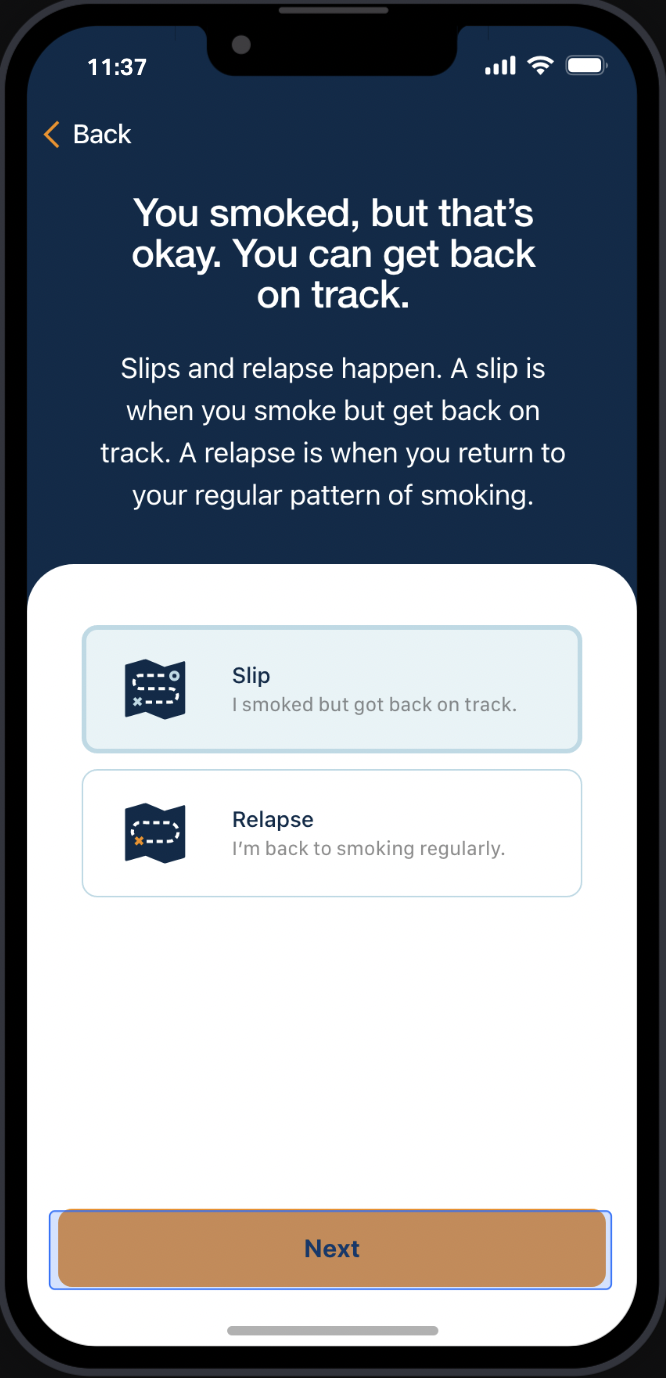
11.
Strategies.
13.
Stress Management.
17.
My Progress.
18.
Four-Headed Monster.
19.
Celebration.
20.
Activities.
21.
Resources.

Outro
California dreaming.
KIC felt that our work transformed their existing app into a digital tool that upheld KIC’s evidence-based research approach while also giving users quit plans tailored to their individual goals. For me, perhaps the best feature of this project was that the app was free, serving as a quitting coach that anyone could carry around in her pocket. That KIC viewed itself as a public service that anyone could access inspired me to keep the copy plainspoken and supportive, helping people fulfill their dreams of quitting smoking. Click the link below and check it out on the Apple Store.
